Bagus! — case study by Ellipsis Creatives





Bagus wanted to establish a clearer and more distinctive brand identity that could communicate its values more effectively.
There was potential to strengthen how the brand presents itself — moving from a functional offering to one that feels more recognisable and confident. The goal was to create an identity that reflects quality and trust, while remaining approachable and easy to understand.
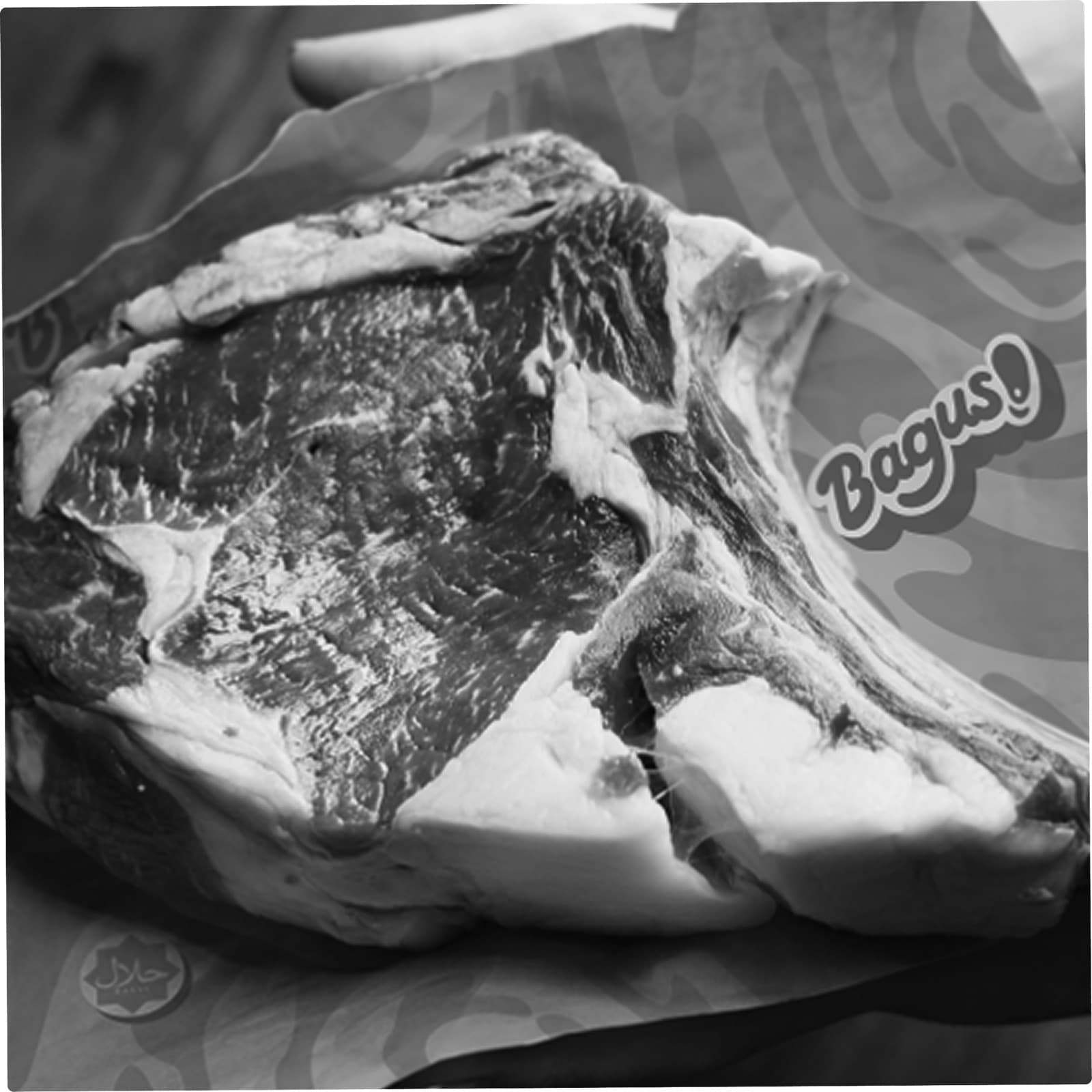
Ellipsis Creatives developed a brand identity and comprehensive brand guide for Bagus.
Drawing from bold yet straightforward elements, the visual system emphasises clarity and recognisability. Colours, typography, and layouts are kept intentional and easy to apply, allowing the brand to communicate effectively across different formats.
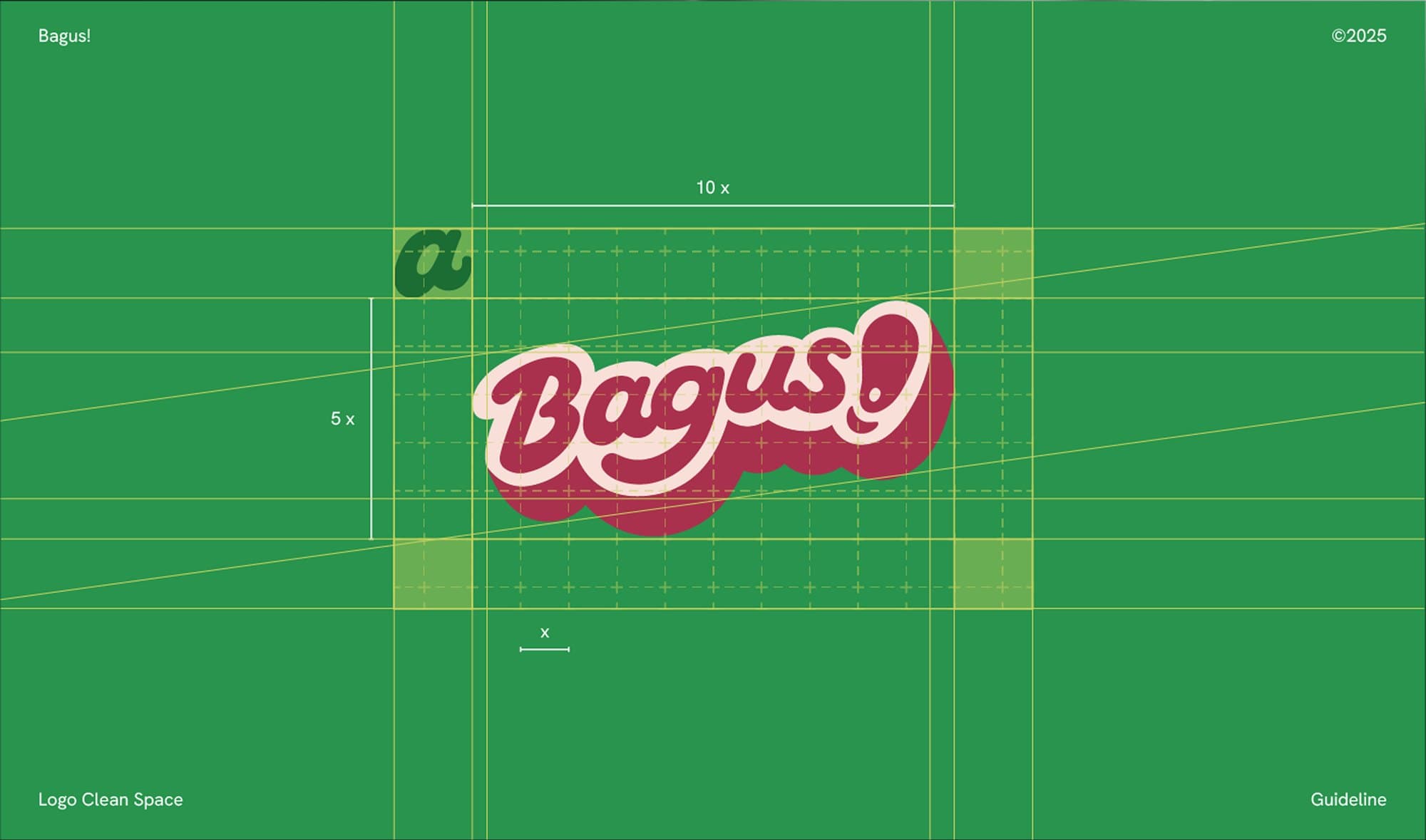
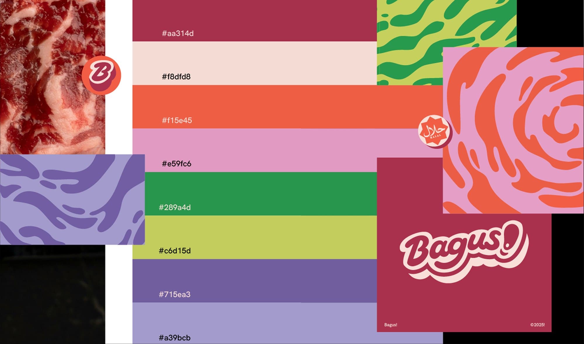
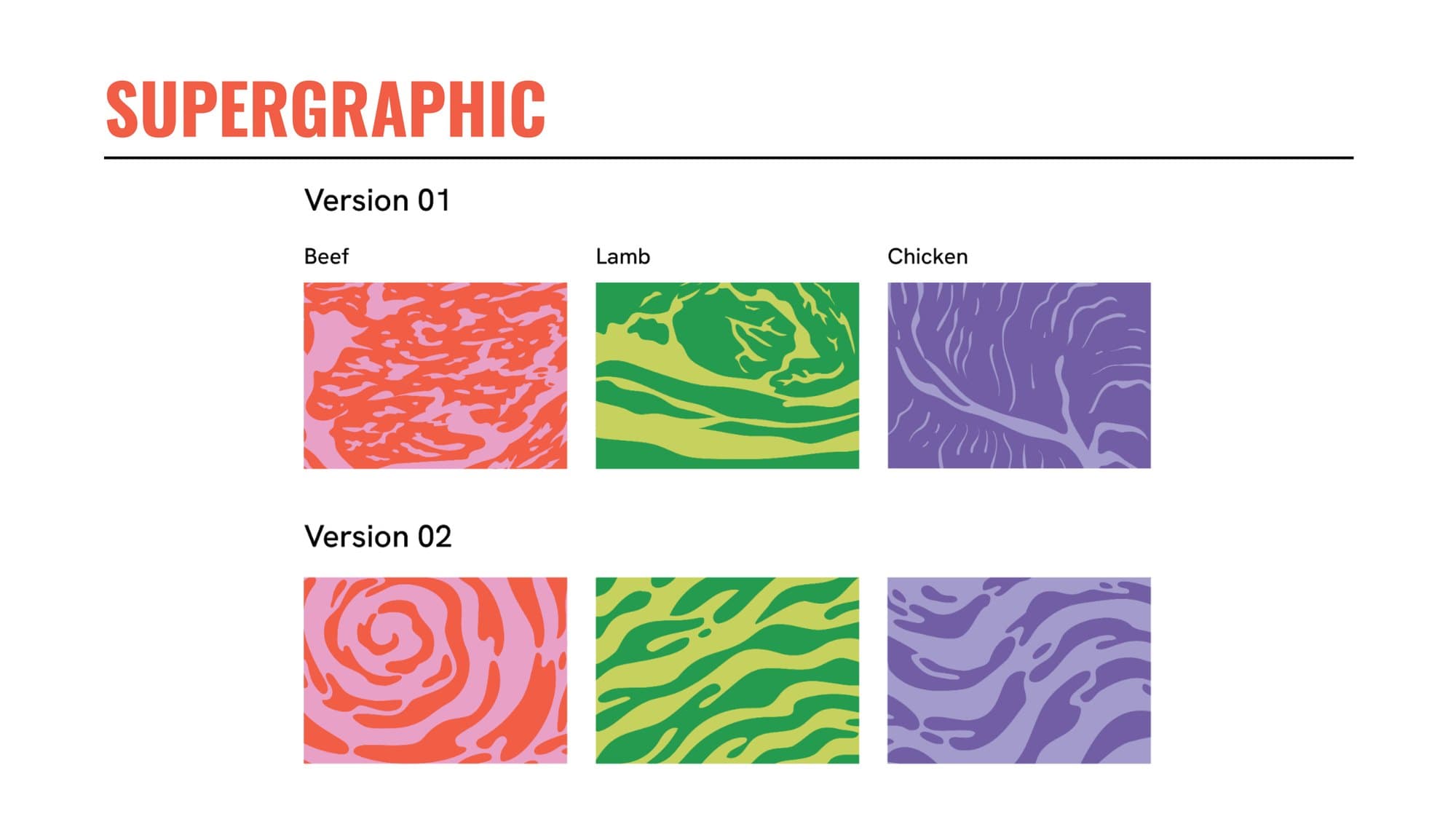
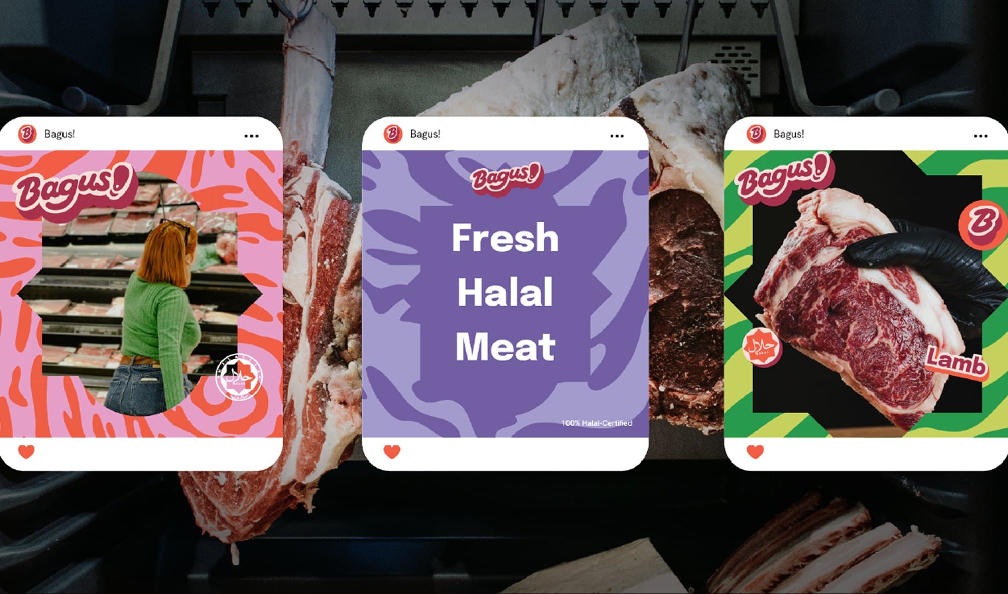
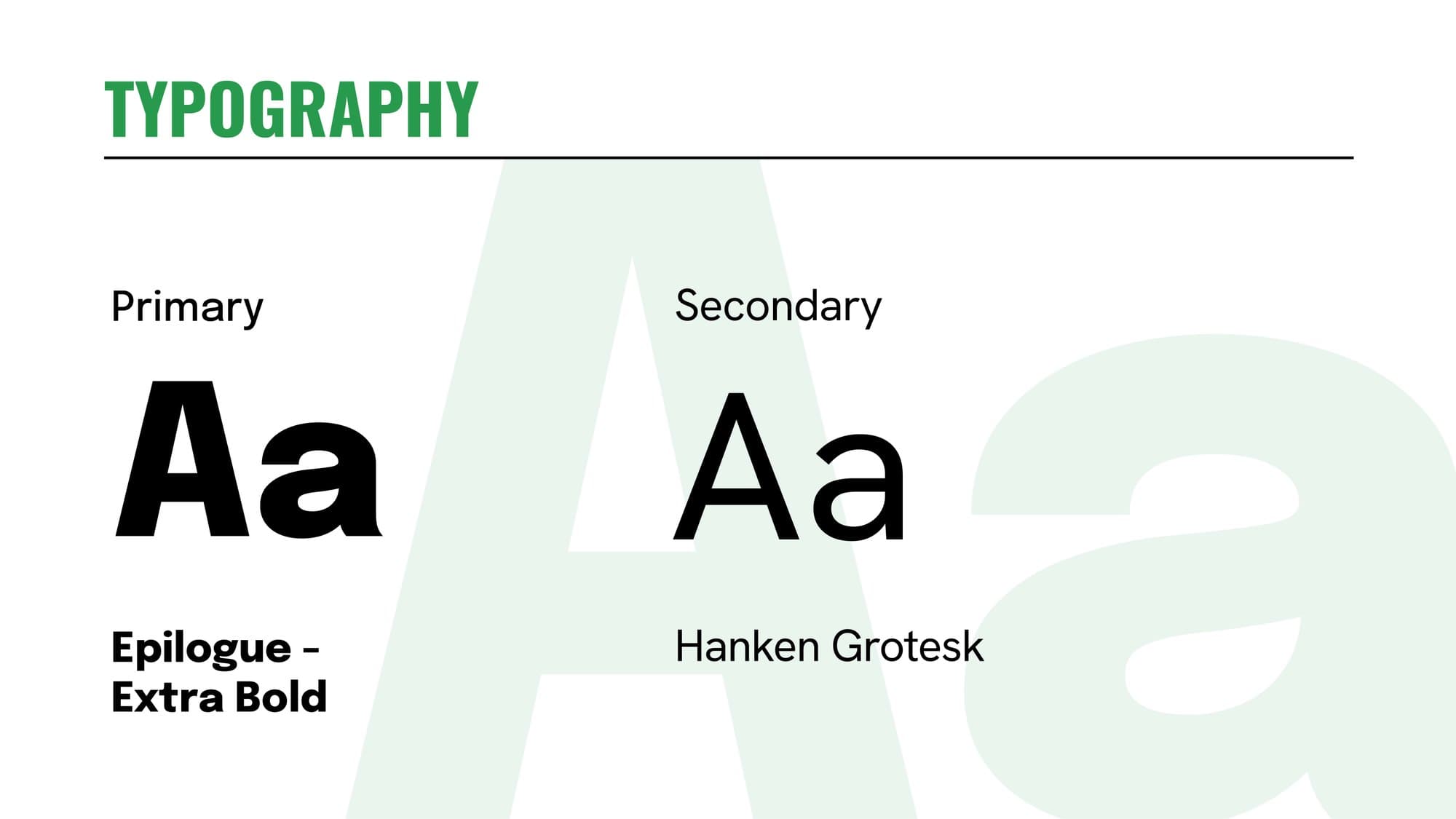
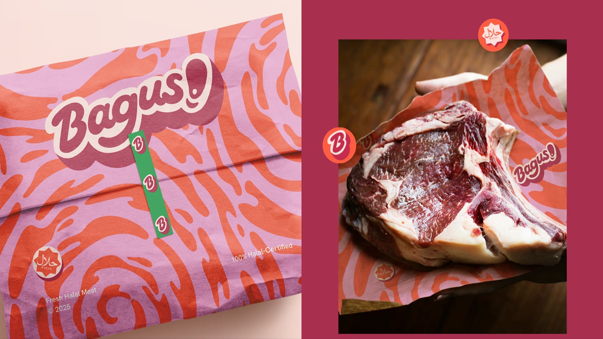
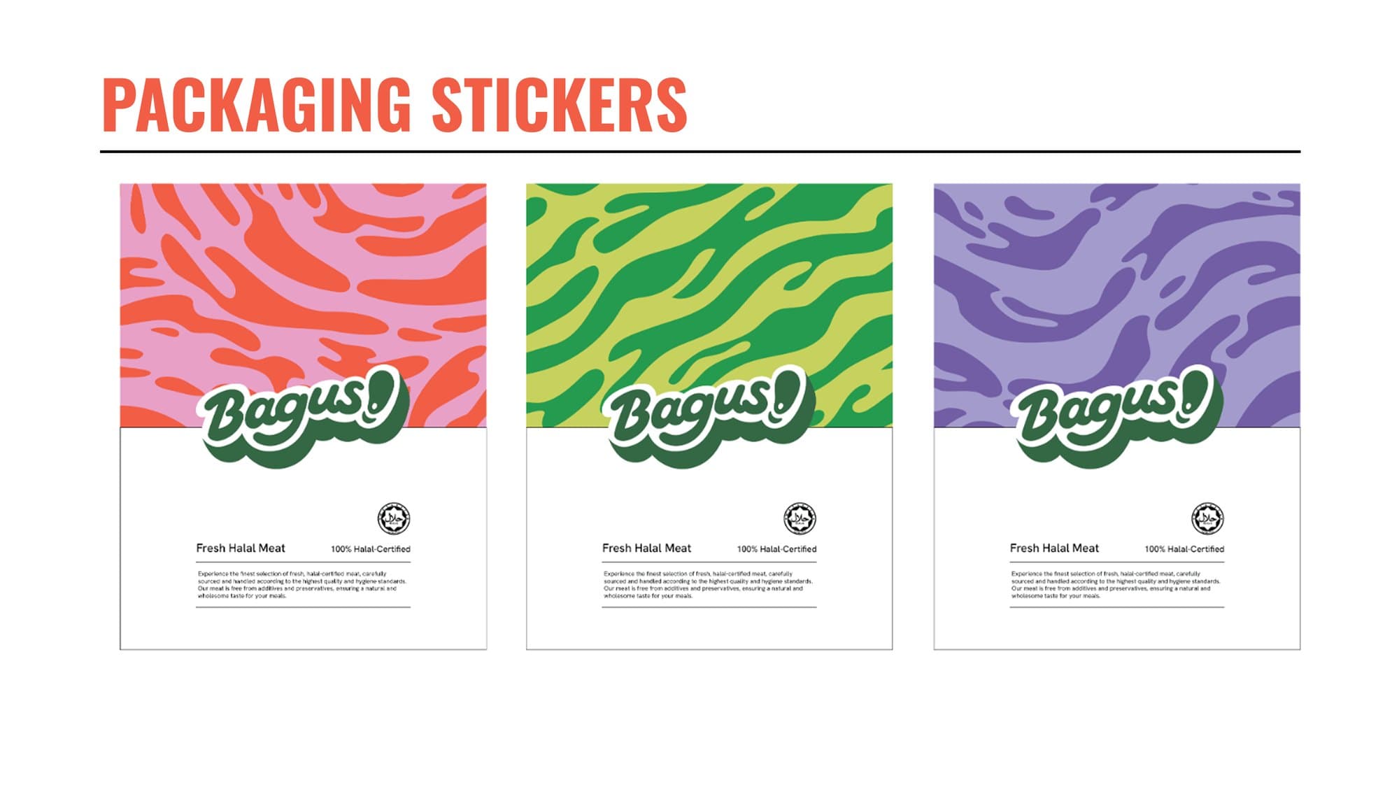
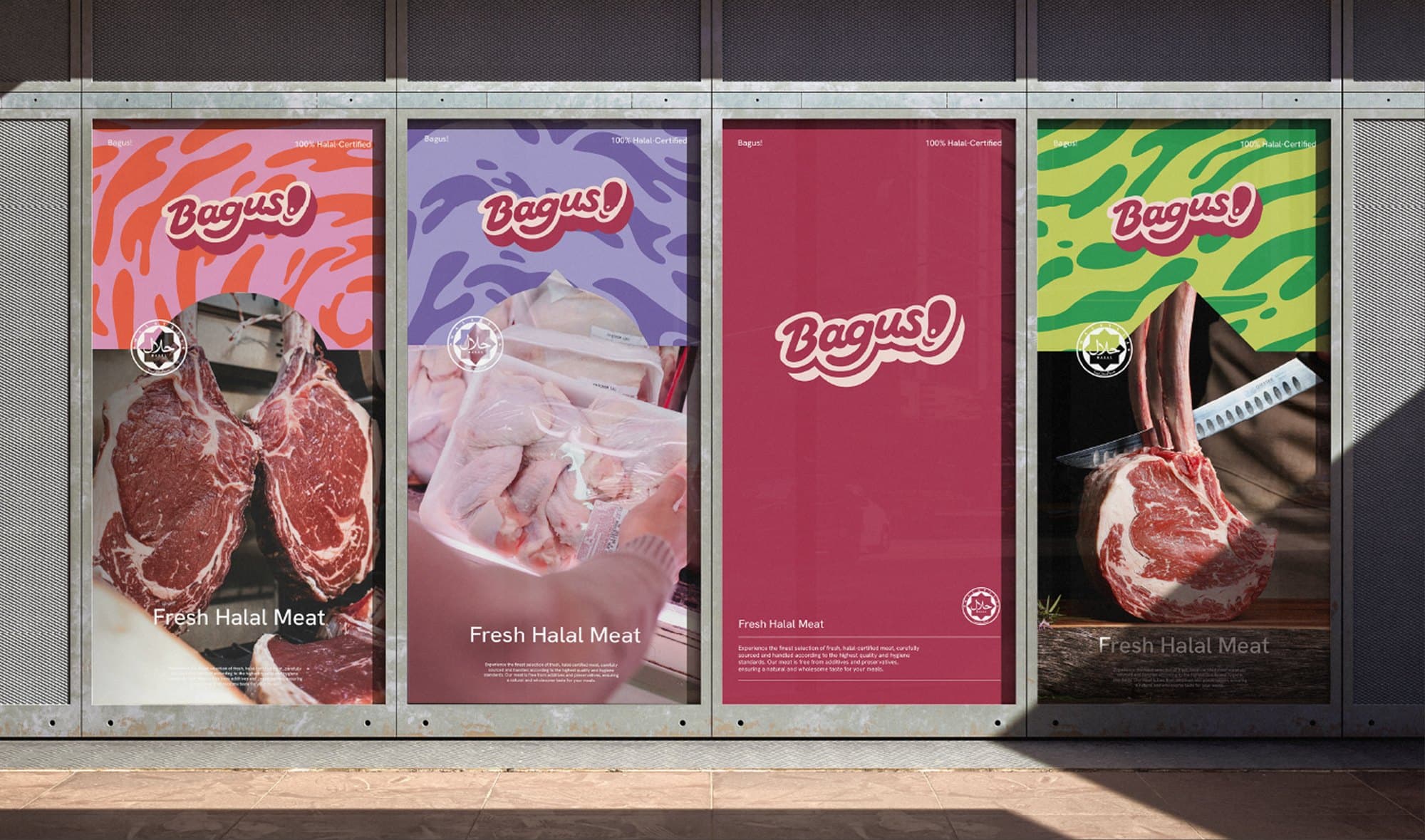
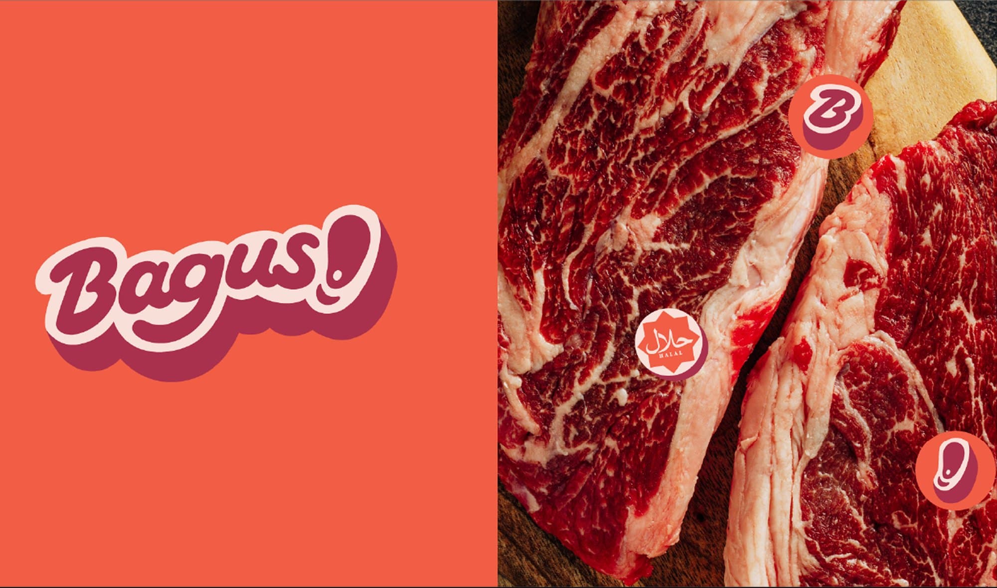
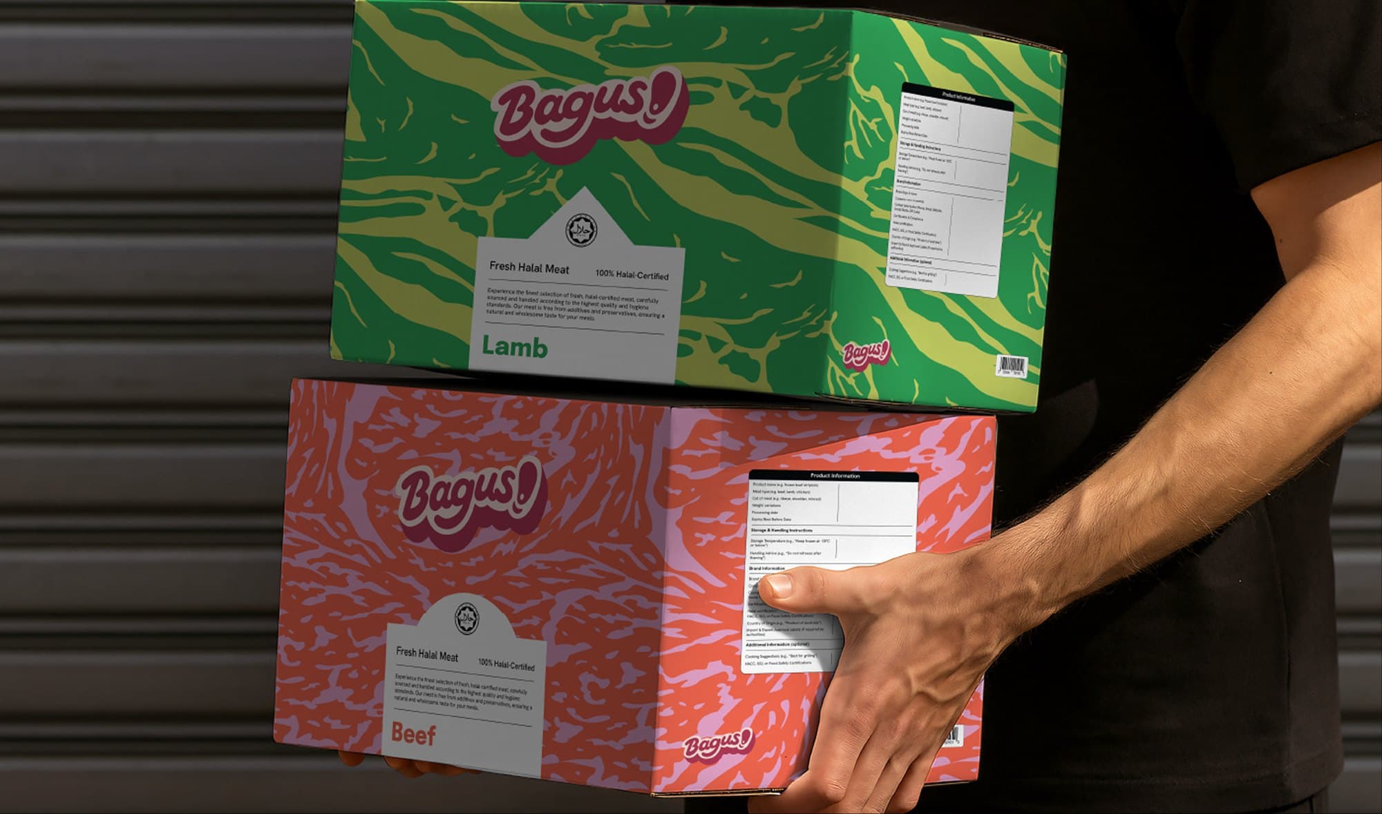
The new identity gives Bagus a stronger and more cohesive brand presence, improving clarity and recognition.
With a defined visual system in place, the brand is now better equipped to communicate consistently and confidently across all applications. Bagus stands with a clearer voice — positioned for growth while staying true to its promise of quality and reliability.