Dippy Holdings — case study by Ellipsis Creatives



Dippy Holdings sought to develop a brand identity that could balance professionalism with personality. As a holdings company, it was important for the brand to convey trust, stability, and credibility. At the same time, there was a desire to retain the uniqueness of its name and origin — incorporating the idea of the dinosaur in a way that feels refined rather than playful. The challenge was to create a logo and typographic system that feels minimal and corporate, while embedding a distinctive visual idea that sets the brand apart.
Ellipsis Creatives developed the logo and typographic identity for Dippy Holdings.
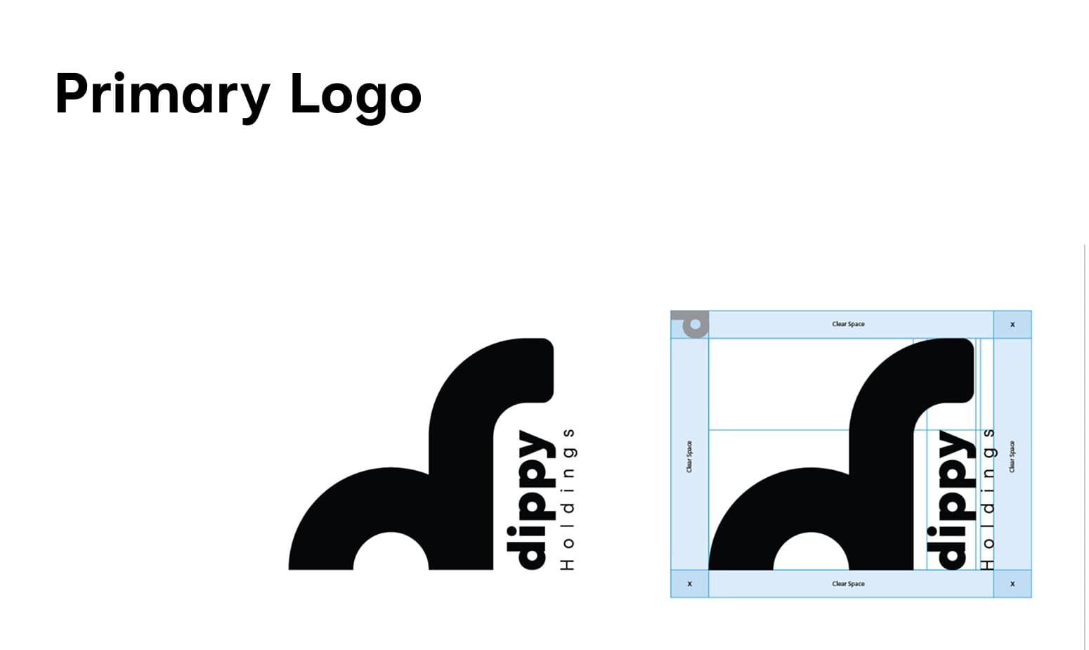
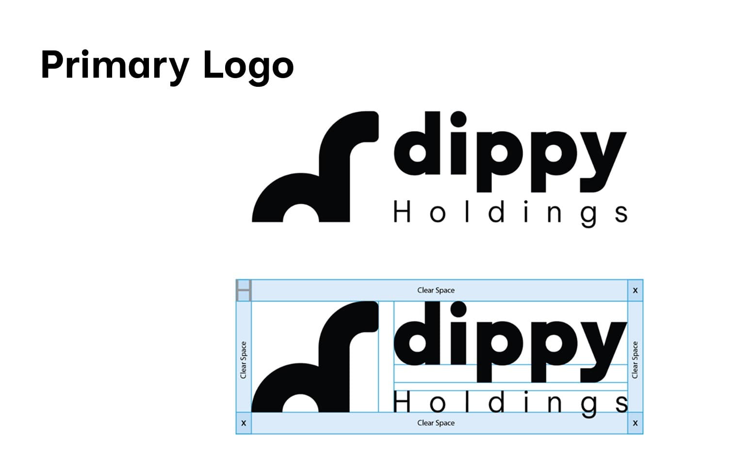
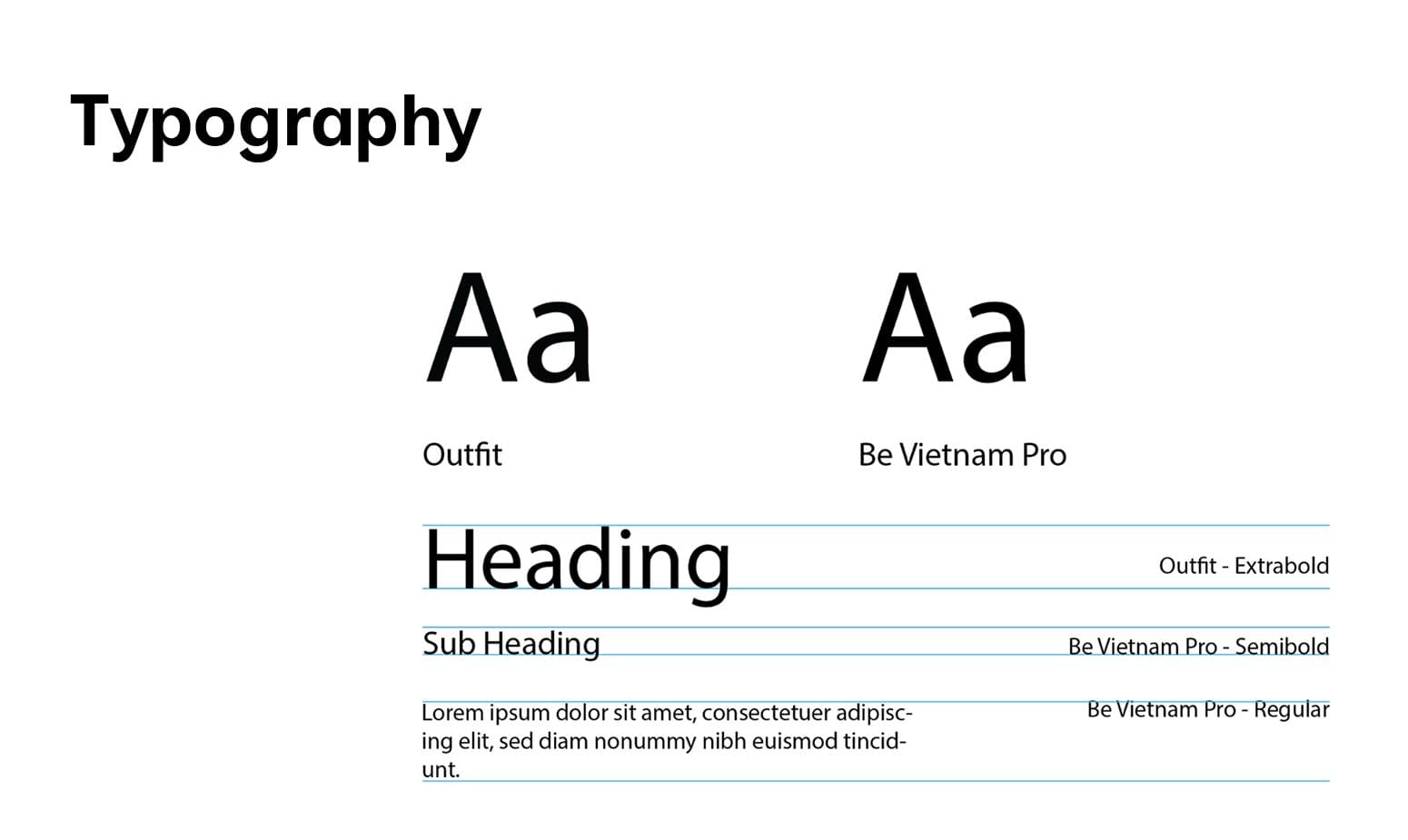
The approach focused on creating a clean and minimal mark that communicates professionalism at first glance, while subtly integrating the brand’s narrative. Alongside this, a typographic system was established to ensure clarity, consistency, and versatility across applications.


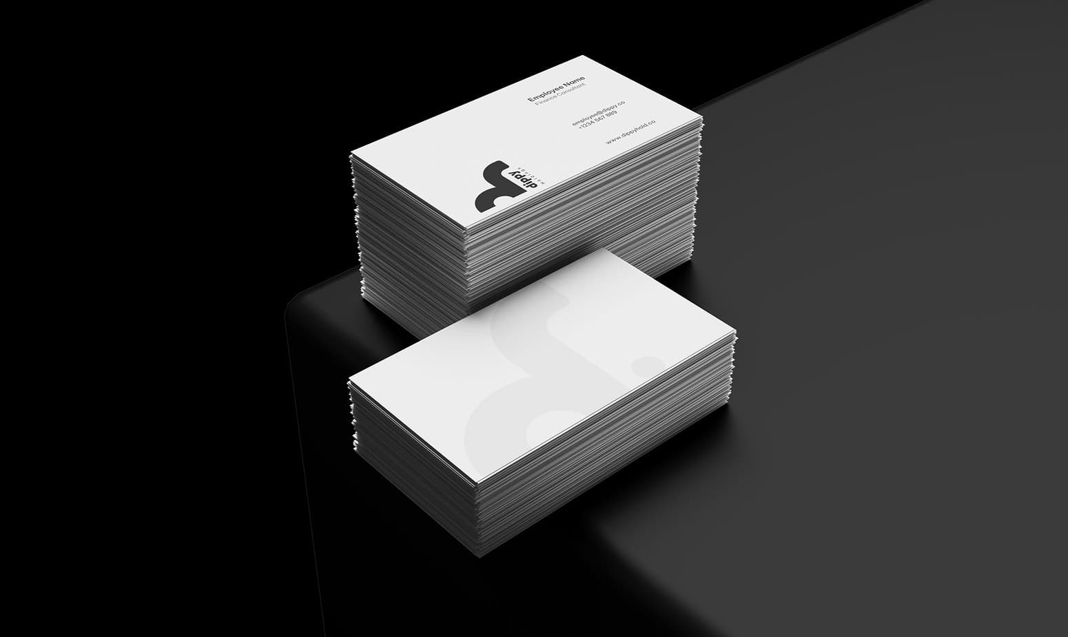
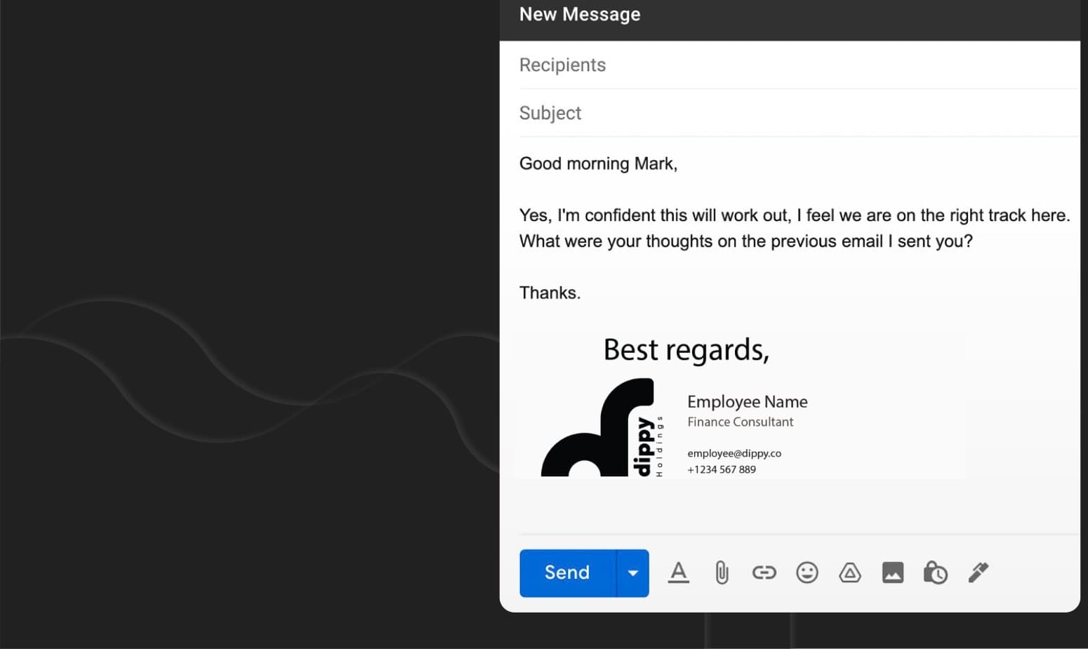
The identity gives Dippy Holdings a clear and professional presence, while setting it apart through a subtle and memorable visual idea.
With a refined logo and consistent typographic system, the brand is able to communicate credibility and confidence across all touchpoints. At the same time, its unique character remains embedded within the identity, creating a brand that feels both established and distinct.