The Growth Project — case study by Ellipsis Creatives



The Growth Project required a brand and digital presence that could better reflect the depth and structure of its offering.
To move away from a generic “self-improvement” aesthetic towards something more defined and credible, one that communicates clarity, discipline, and results. At the same time, the website needed to better support content delivery, programme clarity, and user navigation.

Ellipsis Creatives developed a brand identity and website for The Growth Project, building a cohesive system across both visual and digital touchpoints.
The approach focused on clarity and usability, ensuring the brand communicates its value directly, while the website serves as a functional platform for content, programmes, and engagement.
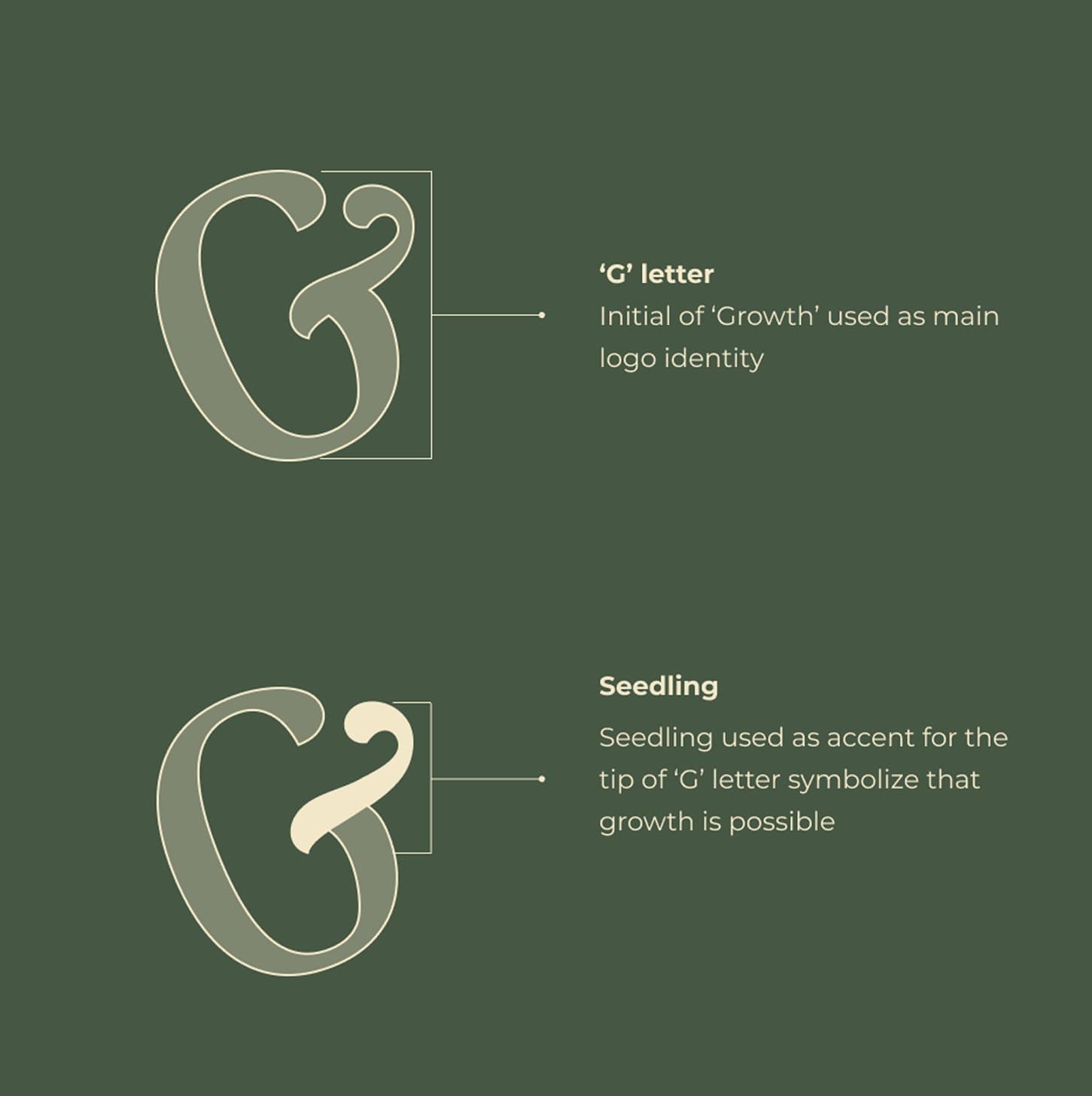
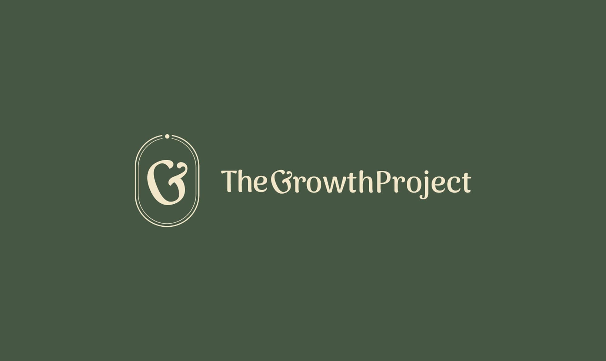
The logo centres around the letter “G”, reimagined as a form in the process of becoming.
Its curved structure subtly mirrors a seedling about to sprout — a visual metaphor for progress, potential, and continuous development.
A small accent at its tip reinforces this idea, suggesting that growth is not static, but always unfolding. The mark captures a moment of emergence, where possibility begins to take shape.
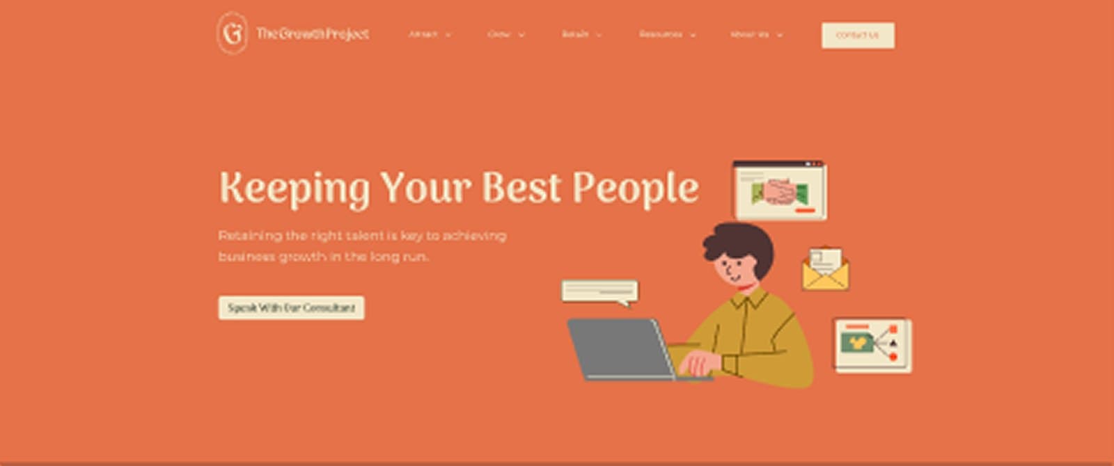
The Growth Project is structured as a three-part journey — attract, grow, and retain.
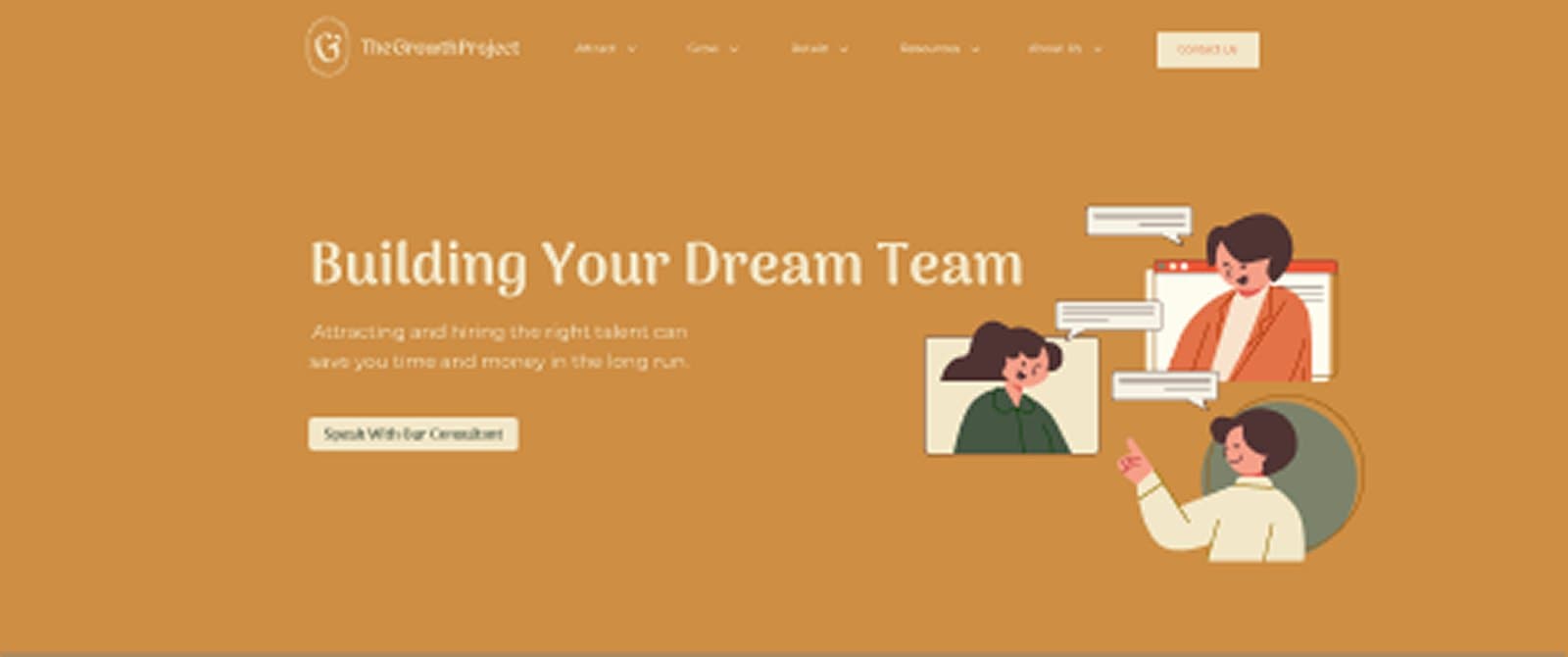
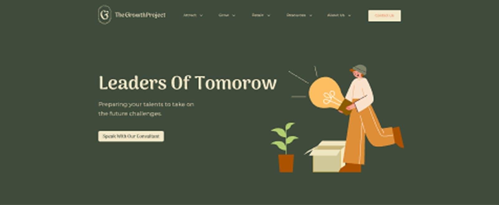
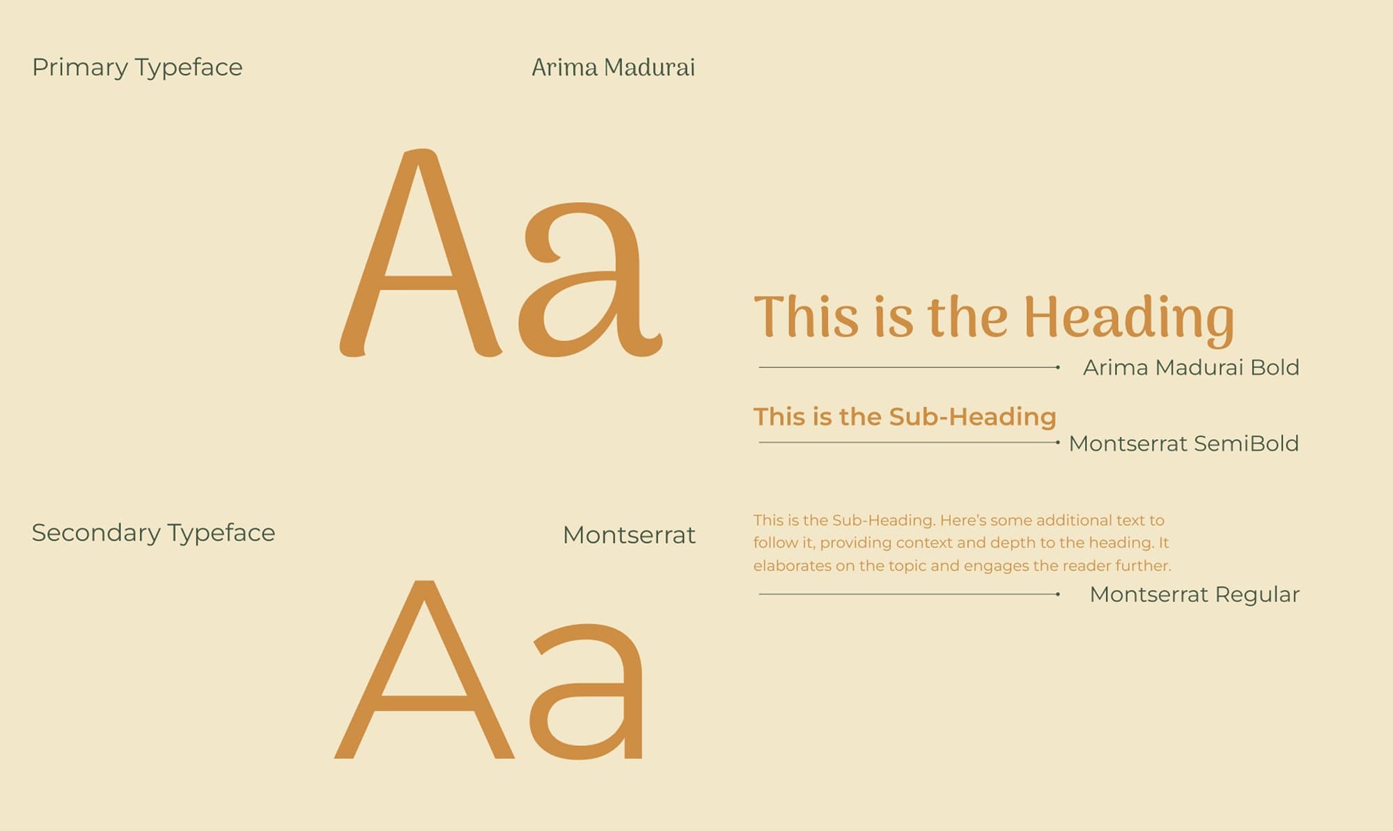

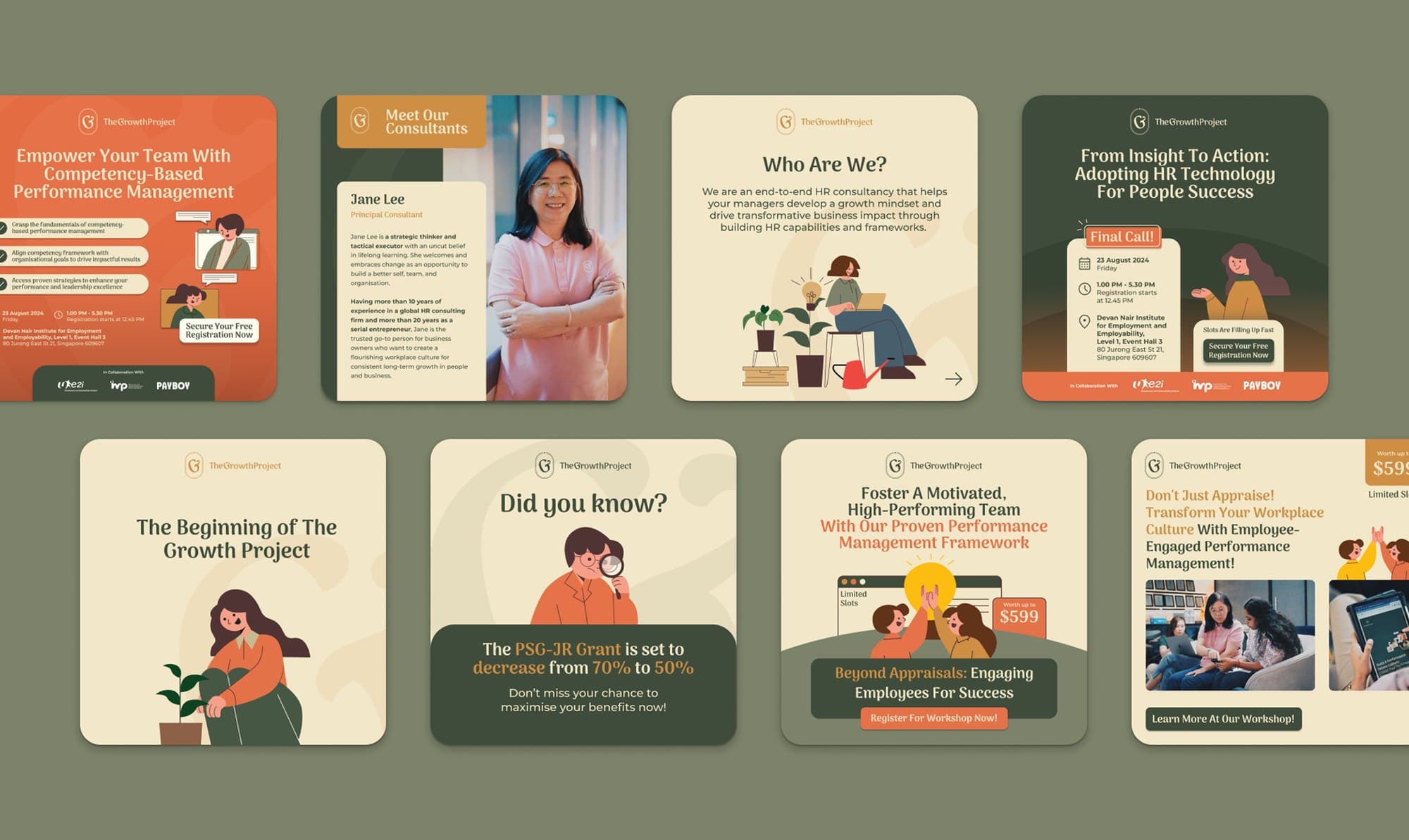
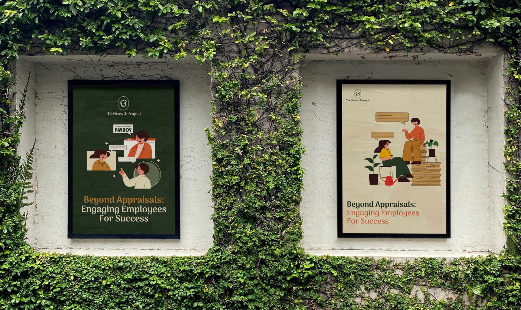

From visual composition to tone of voice, every element is designed to position the brand as both aspirational and accessible — appealing to individuals who align not only in skill, but in mindset and values.

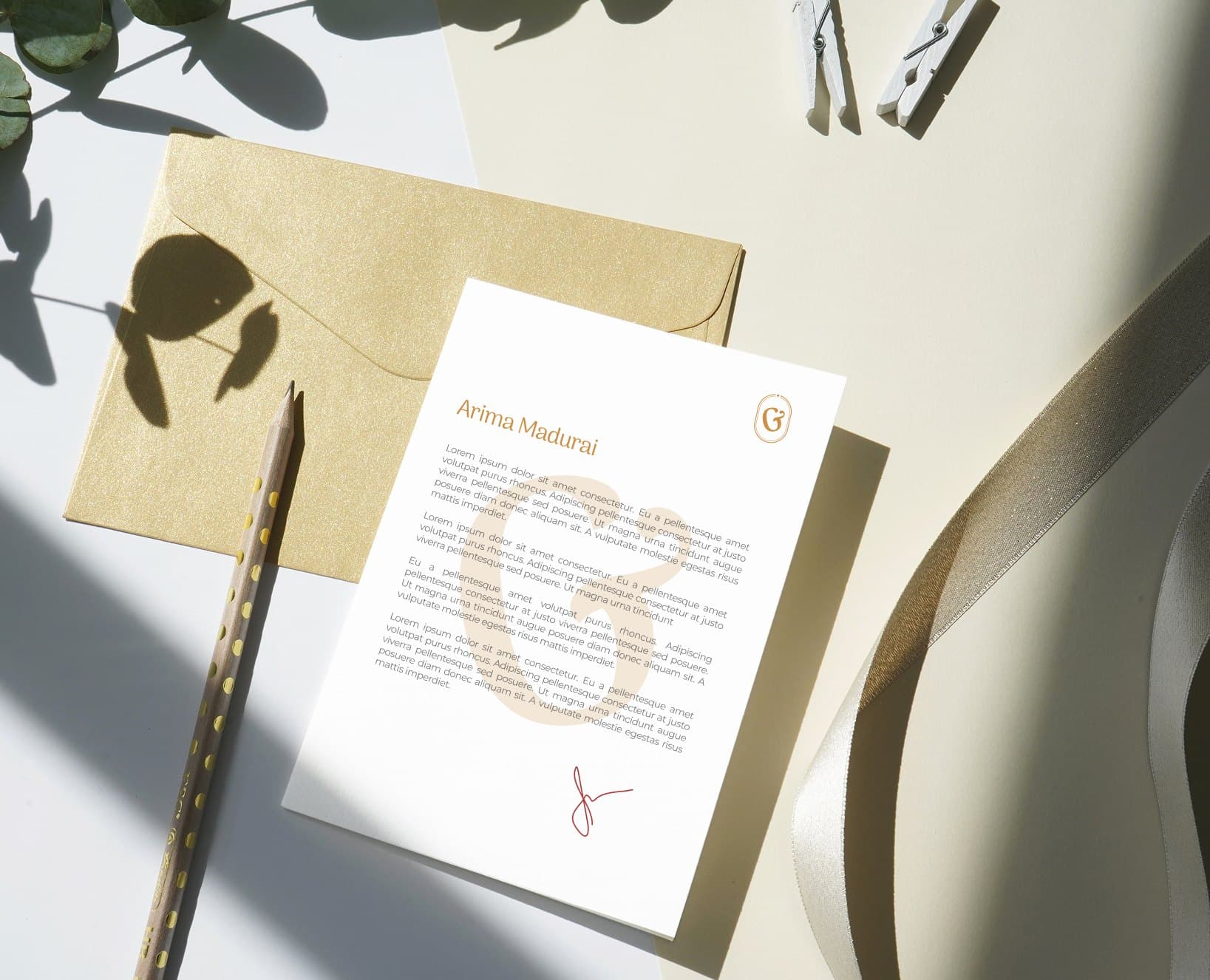
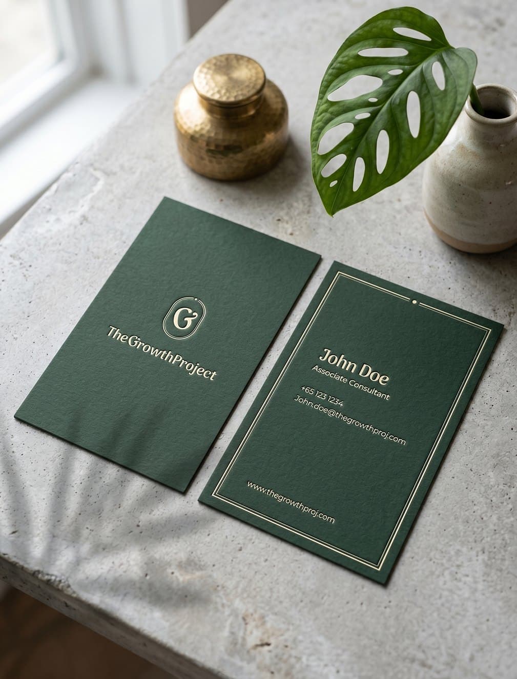
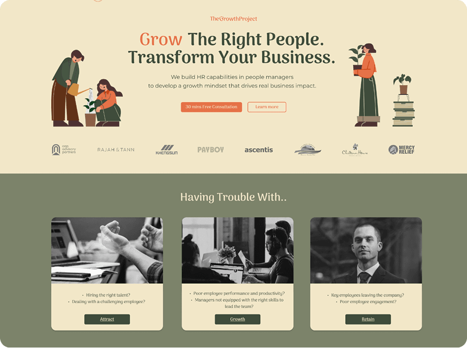
The refreshed brand and website provide The Growth Project with a more defined and credible presence, strengthening clarity and user engagement.
With a structured identity and improved digital experience, the platform is better equipped to communicate its value, support its audience, and scale its offerings. It now stands as a focused and cohesive brand — aligned with its core philosophy of intentional, sustained growth.