JÄÄDE — case study by Ellipsis Creatives



Mineral Water
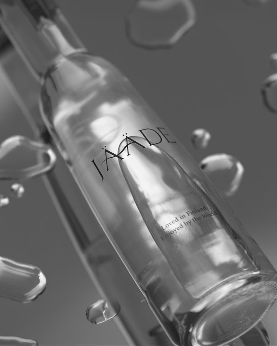
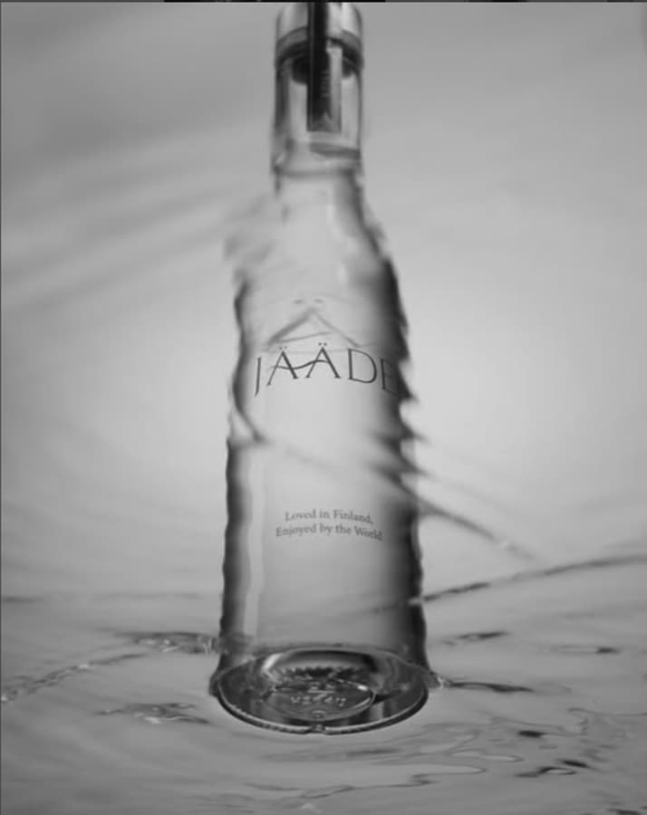
The challenge was to grow visibility and reach while preserving the calm, refined tone that defines JÄÄDE — ensuring every touchpoint felt elevated, intentional, and true to the brand’s quiet sophistication.
JÄÄDE sought a rebrand that would elevate its visual identity while better communicating the origins and purity of its glacial water source. Alongside the refreshed branding, the brand also required a long-term social media strategy to strengthen its digital presence and build deeper audience engagement.
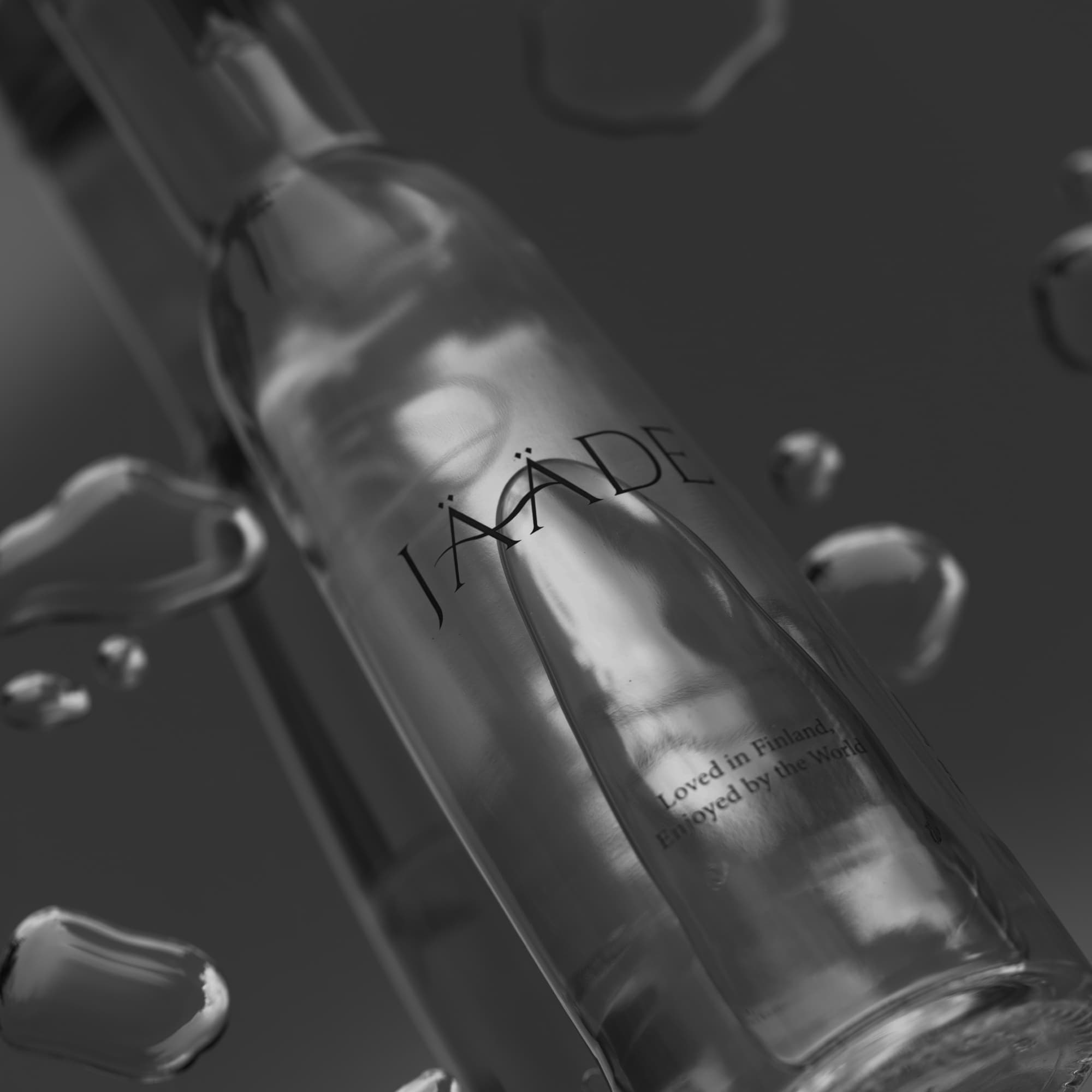
Ellipsis Creatives approached this as a holistic brand transformation rather than a surface-level redesign.
We developed a cohesive brand ecosystem that extends beyond visual identity — encompassing seasonal packaging, art direction, and social media language. Every touchpoint was carefully considered to reflect JÄÄDE's essence of purity, calm, and natural integrity.
By establishing a consistent and elevated visual and narrative direction, JÄÄDE is now positioned to grow its audience with clarity and intention, while maintaining a distinct and premium presence across all platforms.

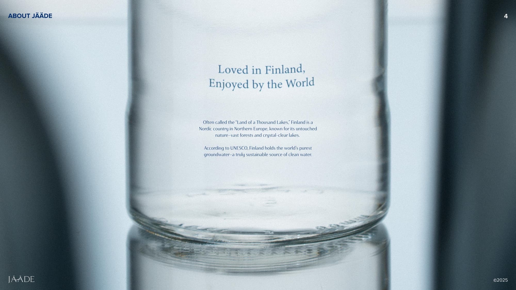
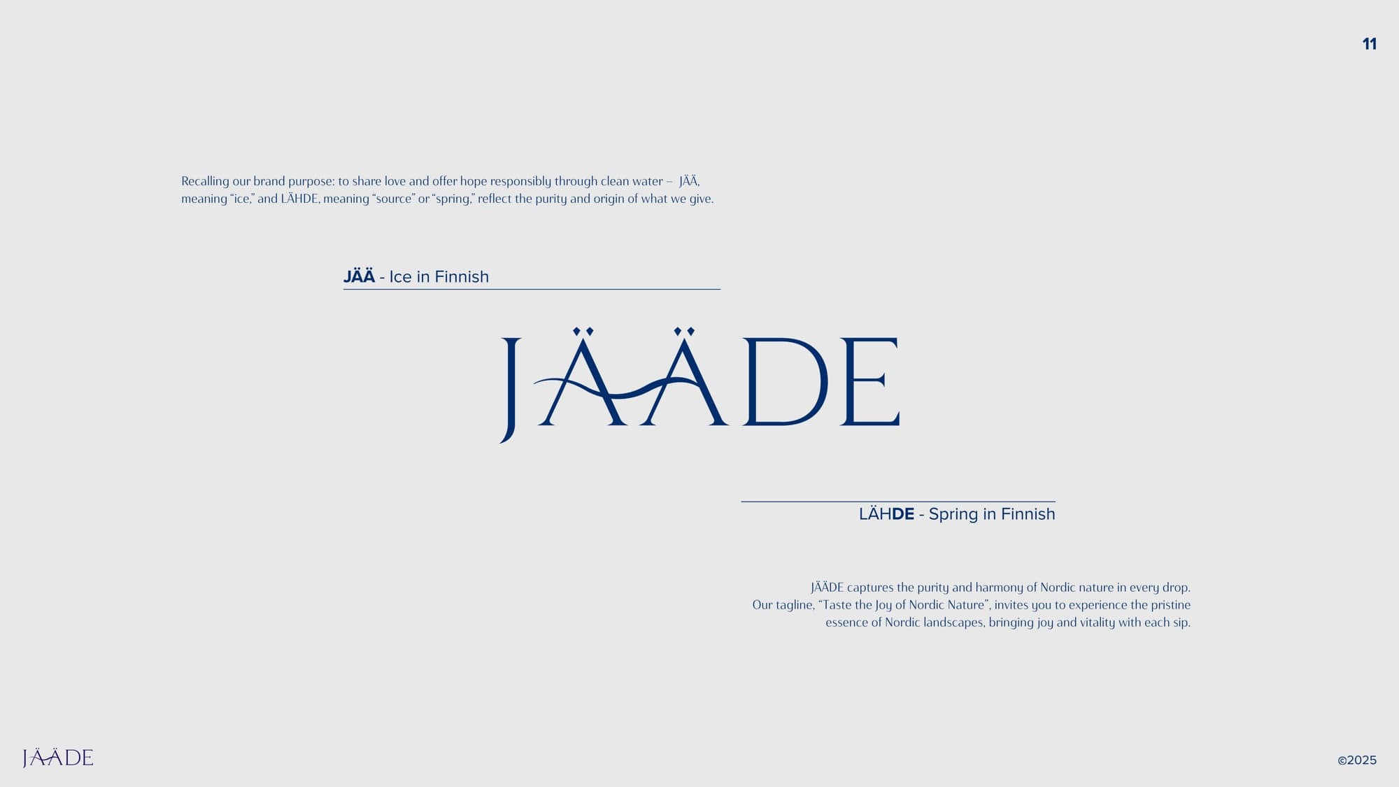
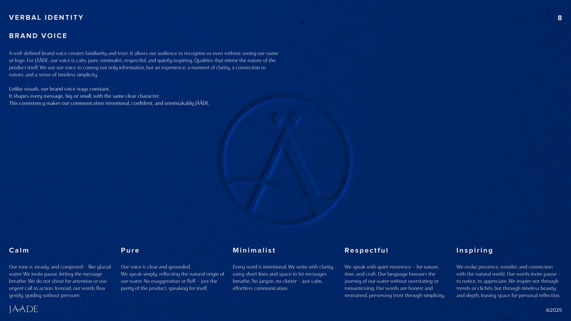
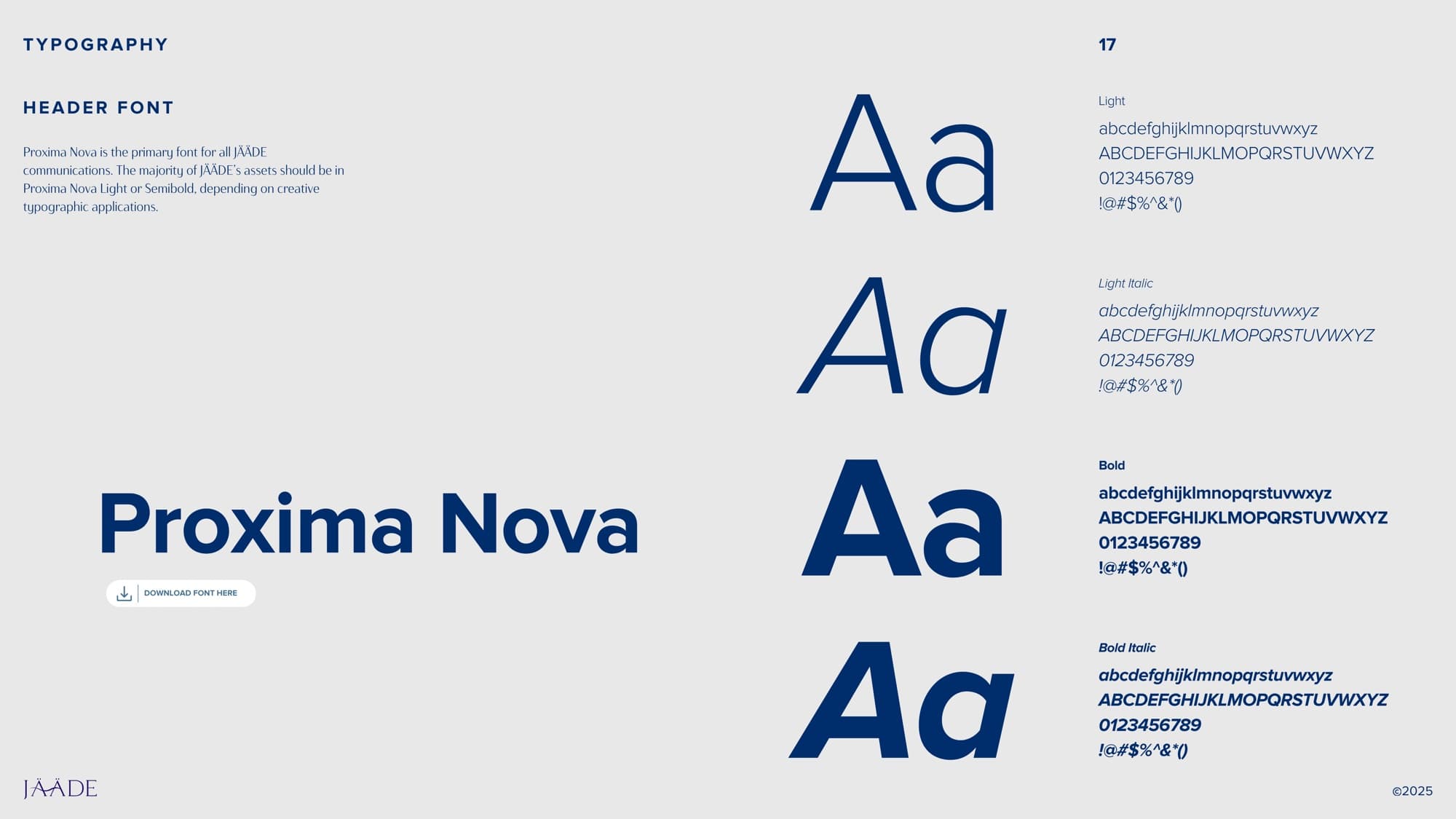
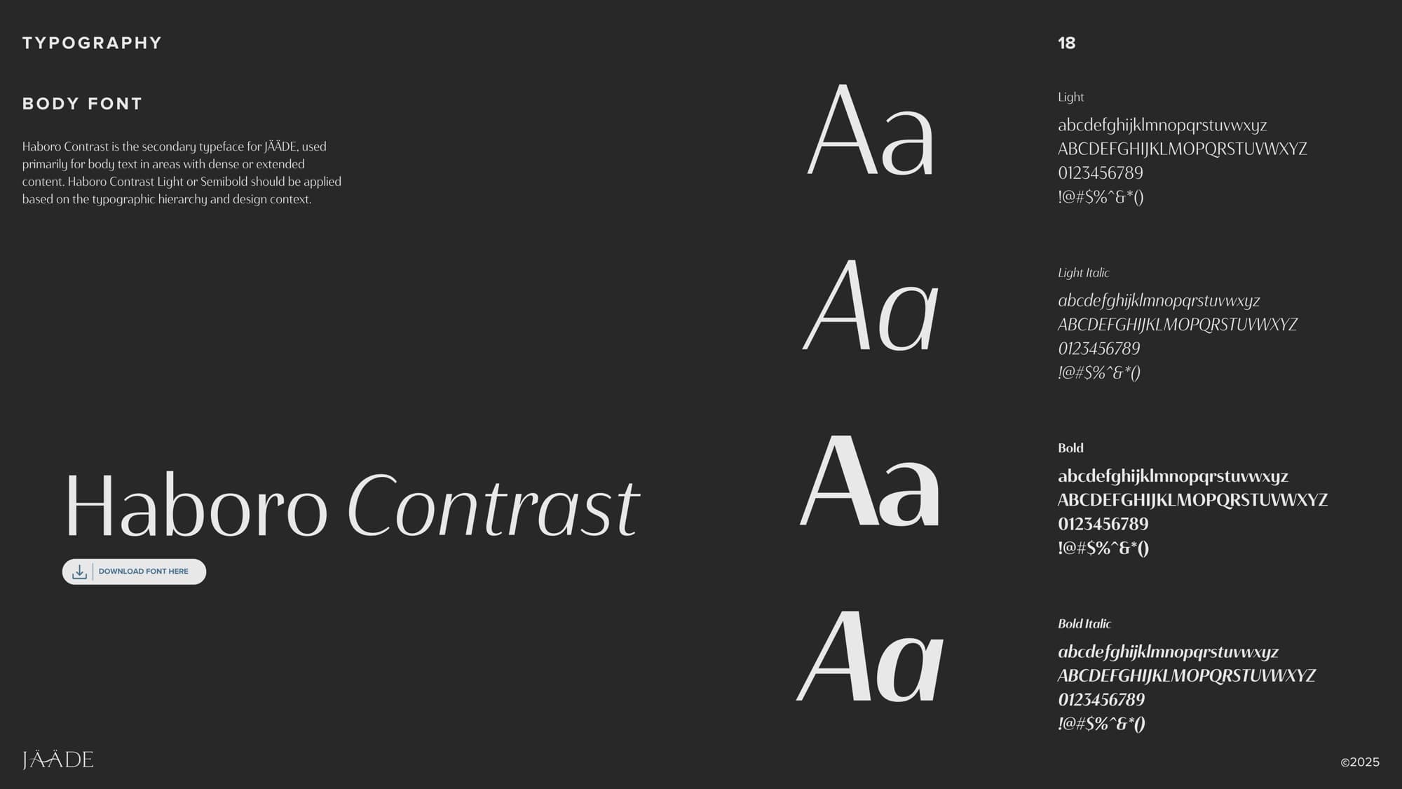
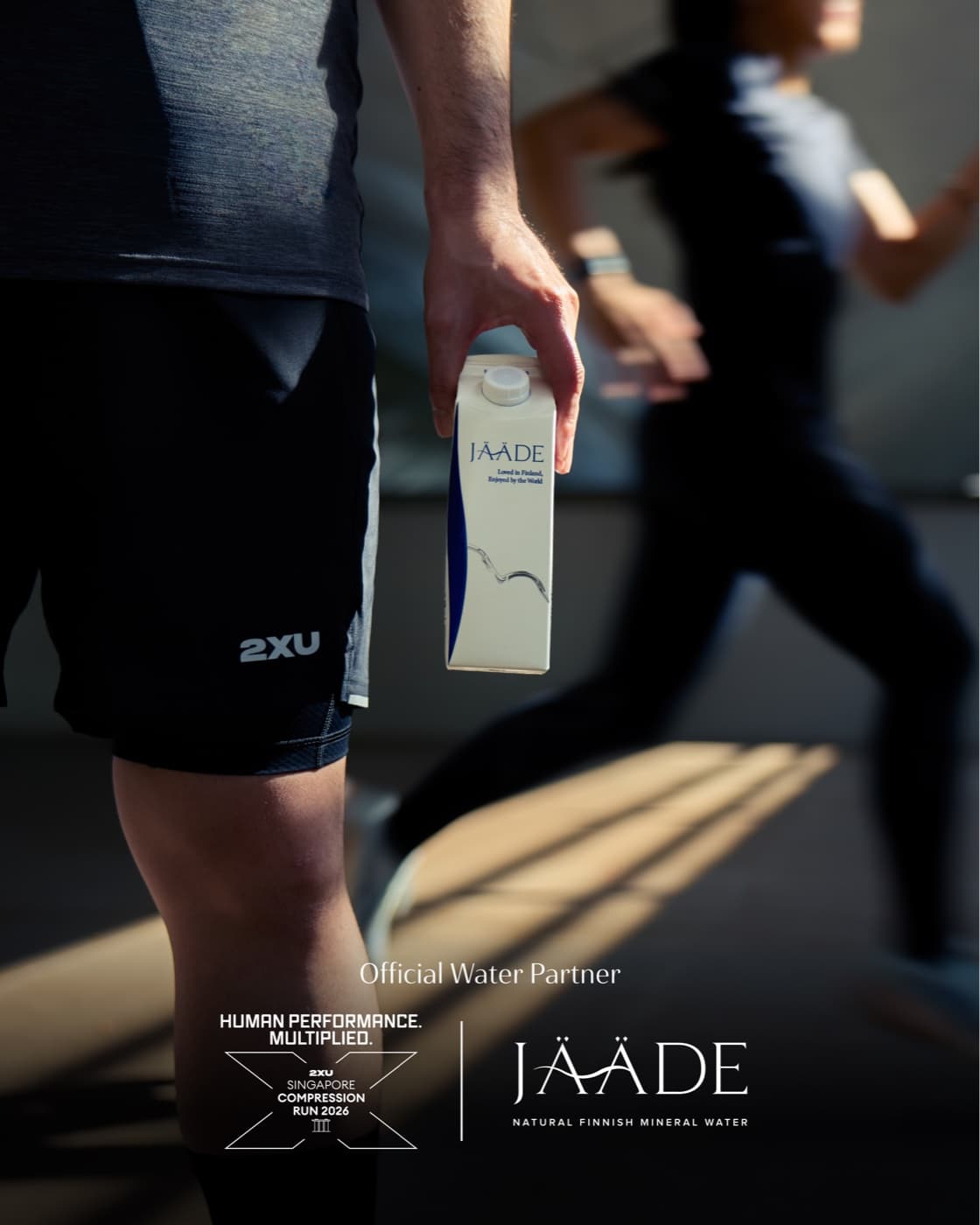


From composition to colour, from pacing to tone of voice, every detail was aligned to create a sense of stillness within a fast-moving digital environment. Content was crafted not just to be seen, but to be experienced — offering moments of pause amidst the noise.
The result is a social presence that grows with subtlety and strength — elevating JÄÄDE’s visibility while maintaining a distinct, premium voice that feels both modern and timeless.
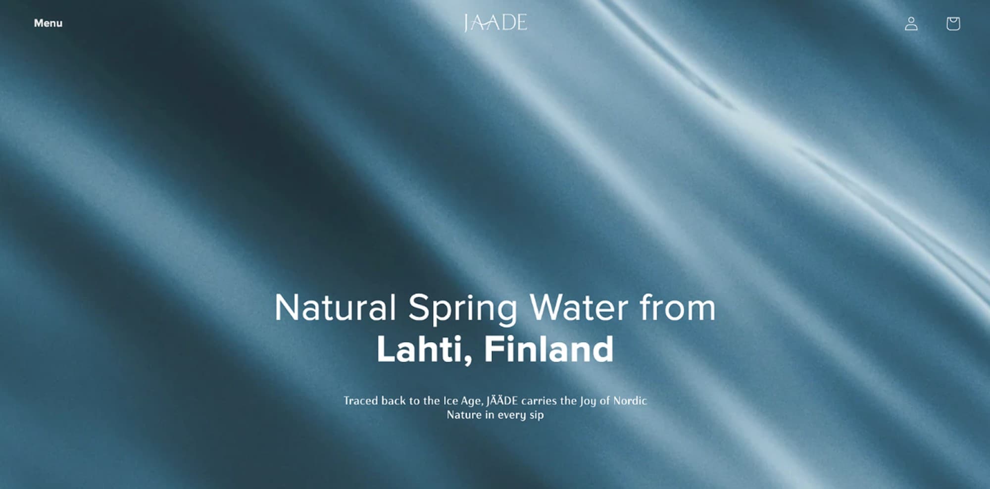
was designed to balance storytelling with functionality — creating a digital experience that feels as calm, refined, and intentional as the brand itself.
For JÄÄDE, merchandising became an extension of the brand world — translating its calm, refined identity into tactile, everyday objects. From tote bags to festive packaging, each piece was designed with the same intention and restraint reflected across the brand system.
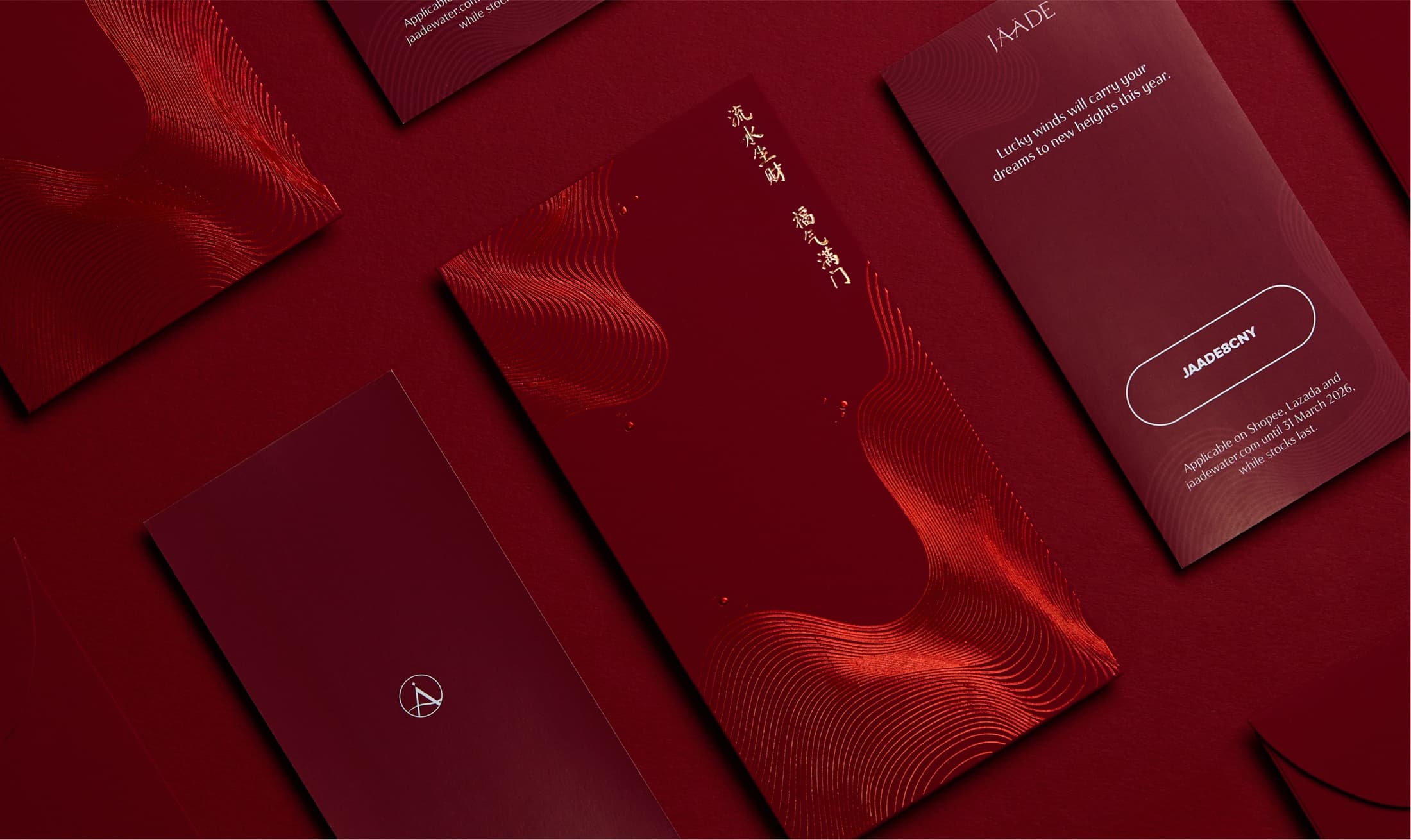
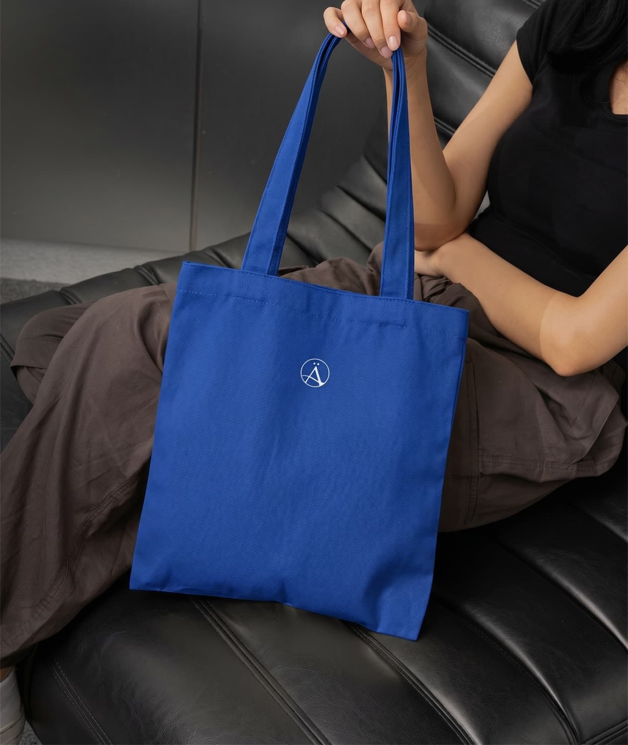

Rather than treating merchandise as just promotional, the direction focused on creating items that felt collectible, useful, and visually aligned with the brand’s philosophy of purity and quiet luxury. A minimal visual language, thoughtful material choices, and clean compositions allowed every application to feel cohesive while remaining functional.