SKIP TO CONTENT

New Peng Hiang — case study by Ellipsis Creatives

This balance between heritage and modernity informed the brand direction: one that feels warm, inviting, and familiar, while remaining confident, refined, and relevant today.
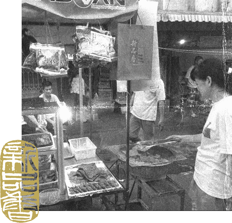
New Peng Hiang heritage hawker stall, black and white, with gold seal stamp
Challenges

New Peng Hiang recognised the need to bring its brand forward in a way that resonates with today’s audience, while staying grounded in its heritage.

Its existing identity held strong cultural value, but there was an opportunity to express this more clearly and consistently across modern platforms. In particular, digital and campaign executions could better showcase the richness of the product and the vibrancy of the brand.

The task was not to reinvent, but to reframe — to present tradition in a way that feels immediate, engaging, and relevant to both loyal customers and a new generation.

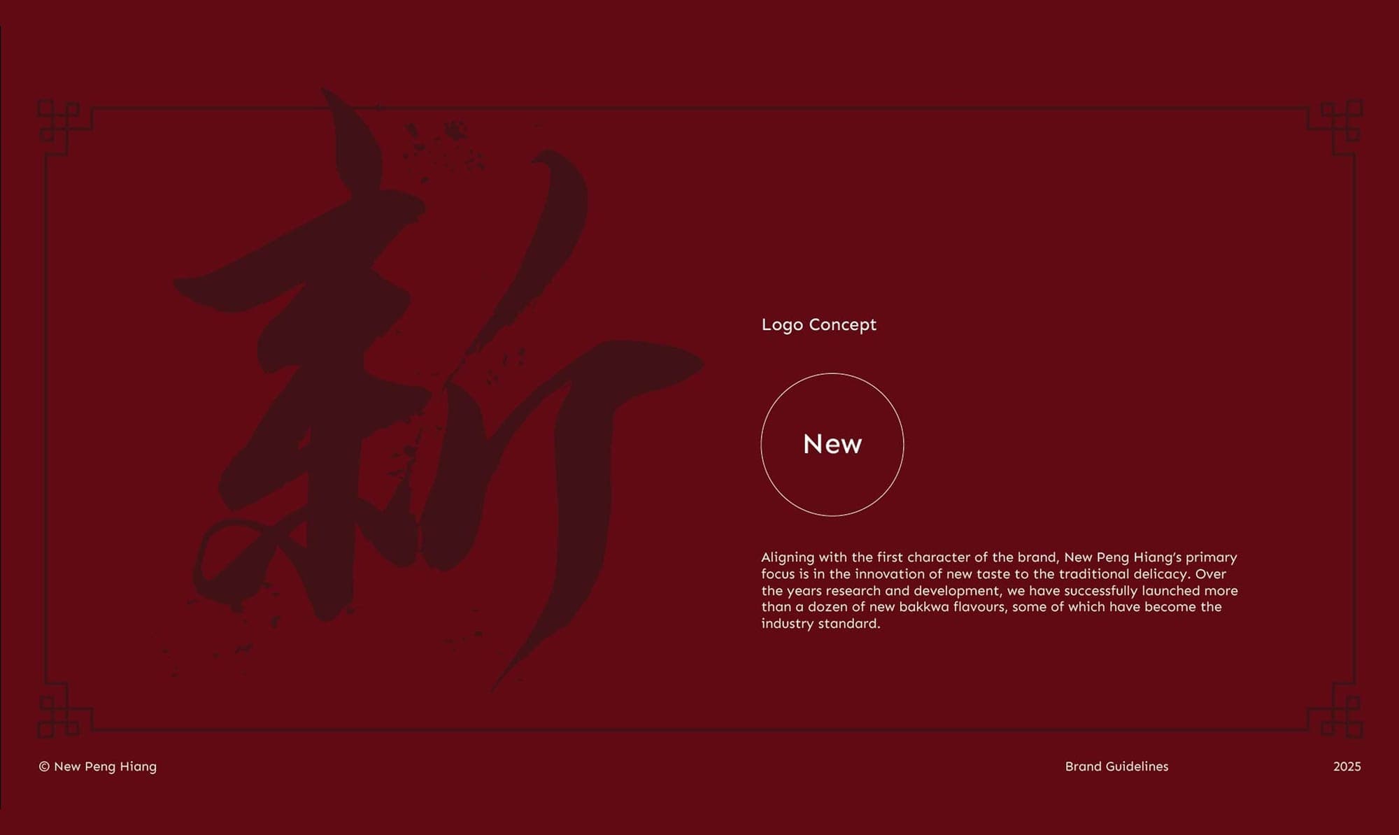
Ellipsis Creatives developed a brand guide and website for New Peng Hiang, reinterpreting its heritage into a modern oriental luxury expression — designed to resonate with a younger audience while preserving its authenticity.
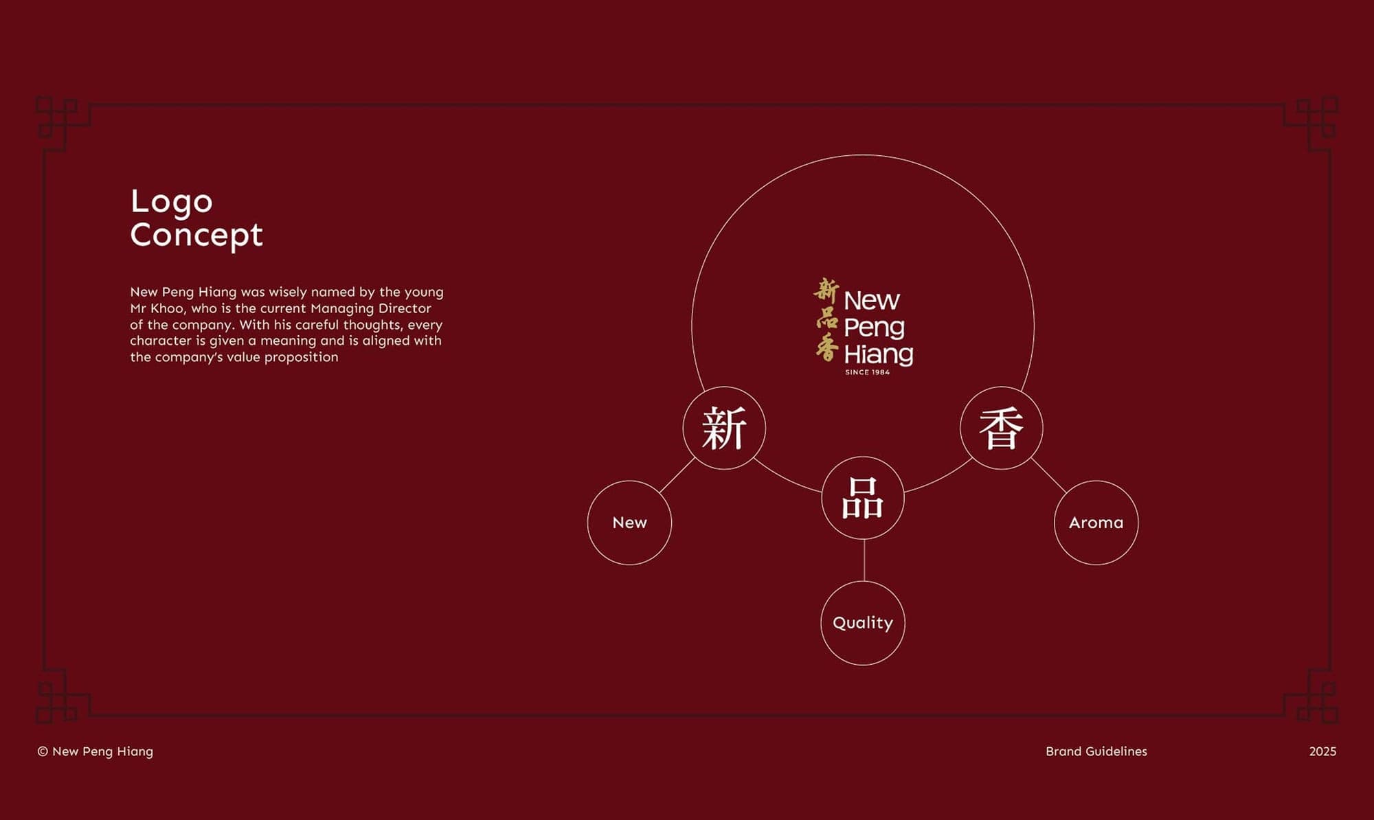
Logo Concept New
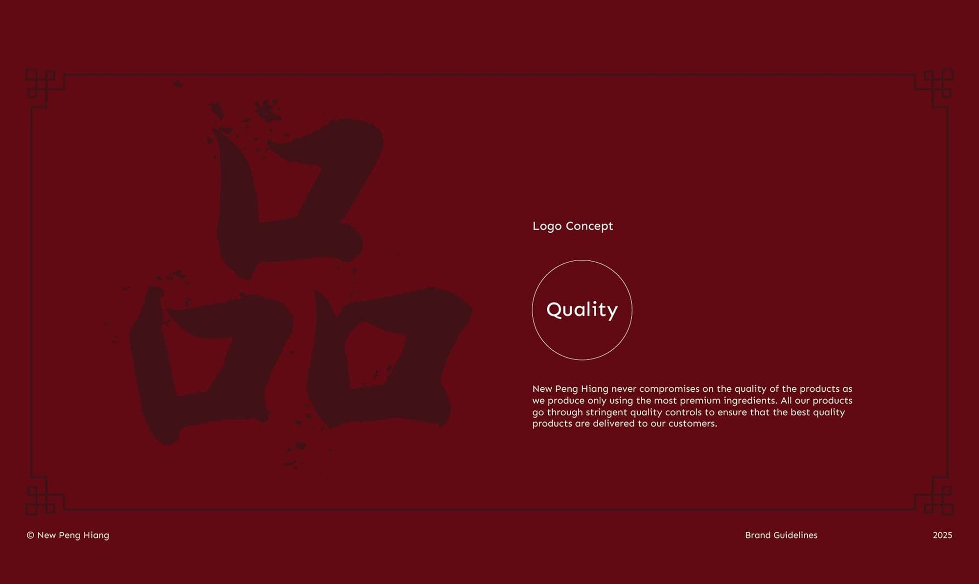
Logo Concept Quality
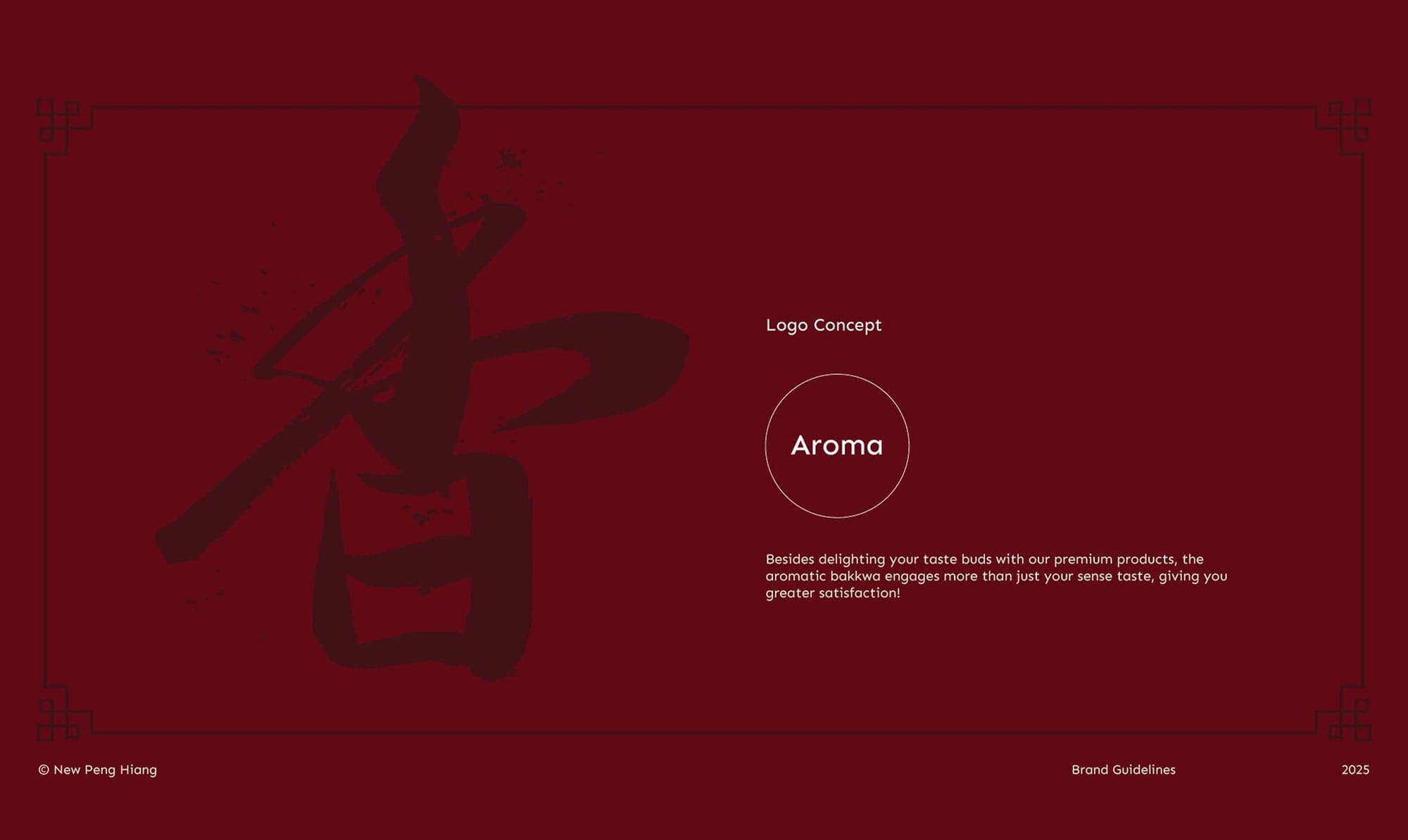
Logo Concept Aroma
Logo Concept overview
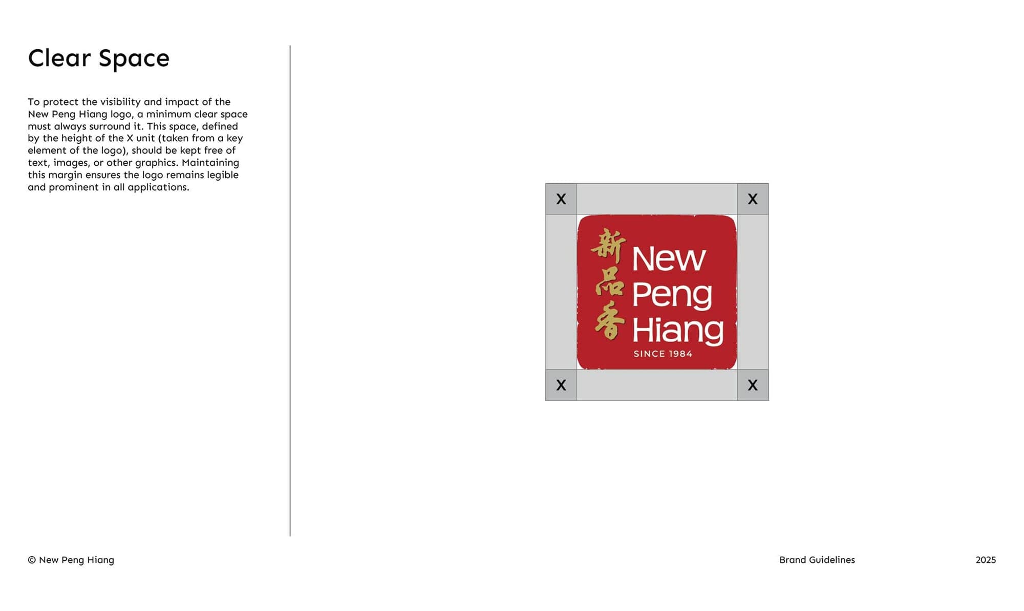
Clear Space
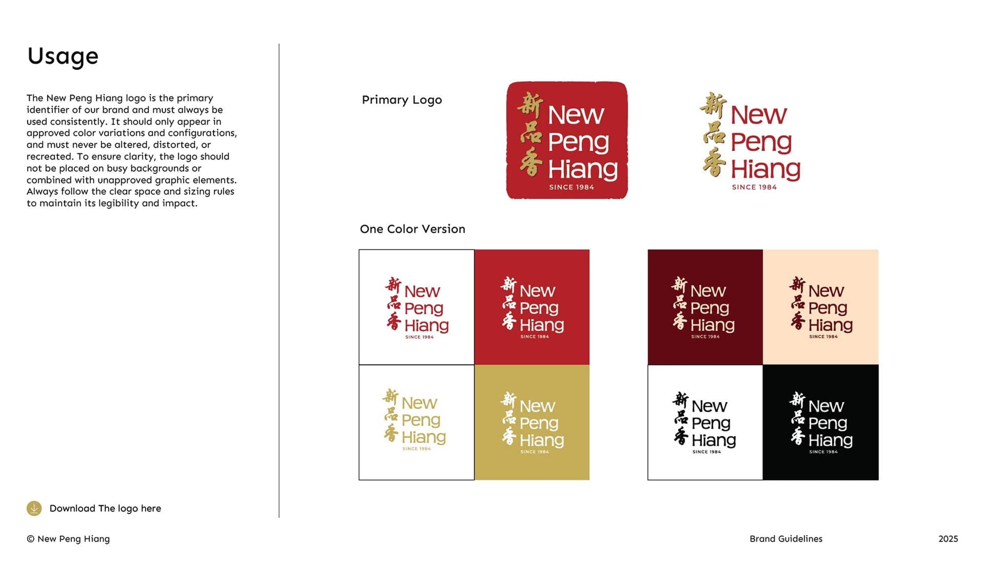
Usage
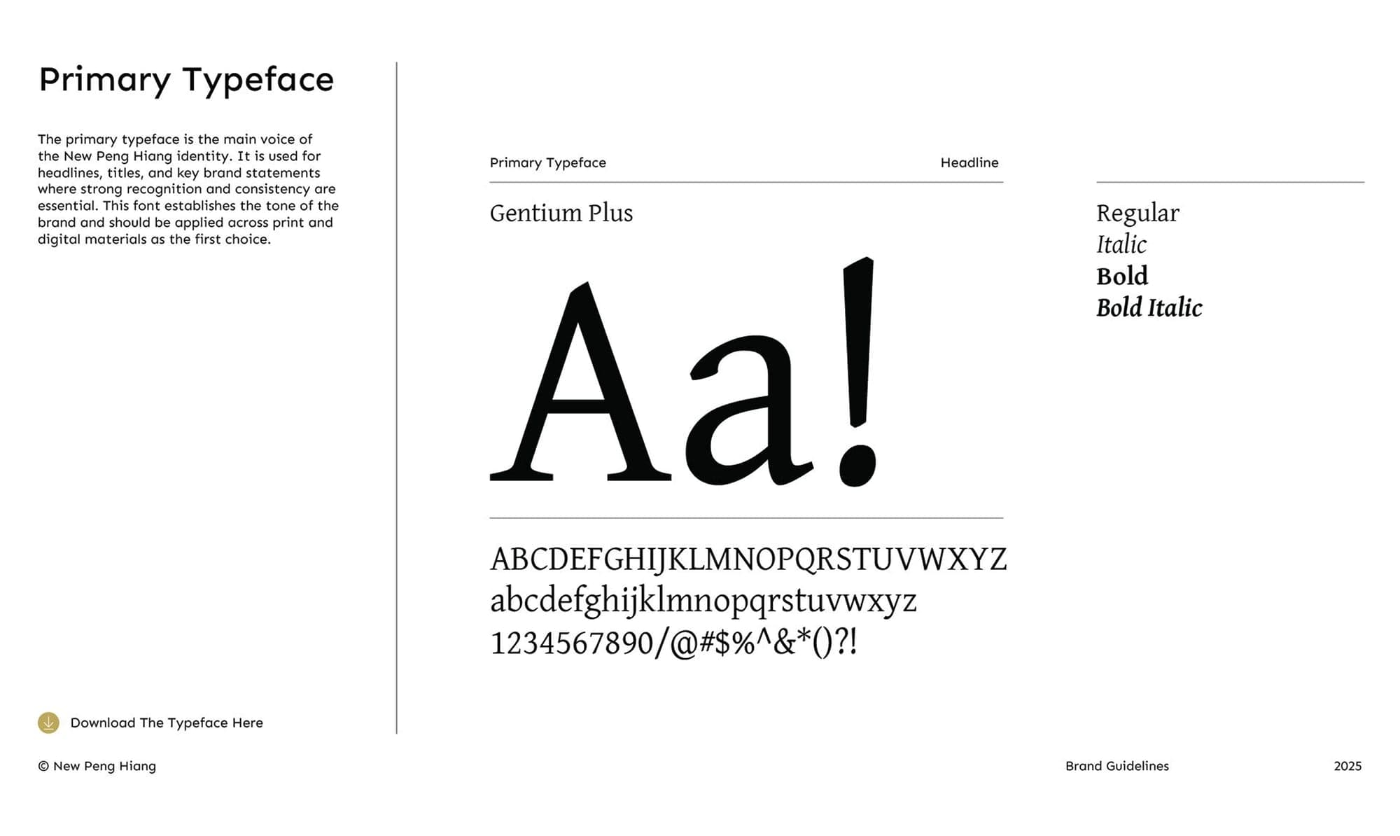
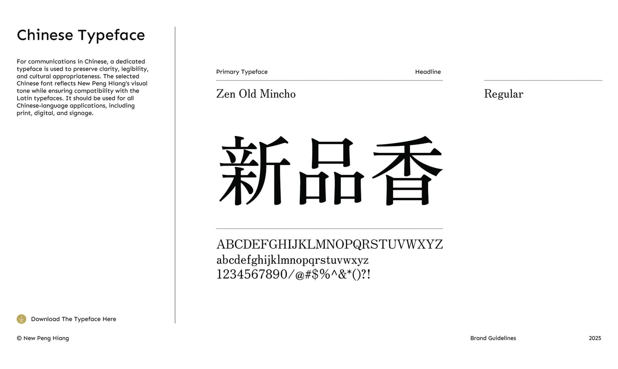
Primary Typeface
Chinese Typeface
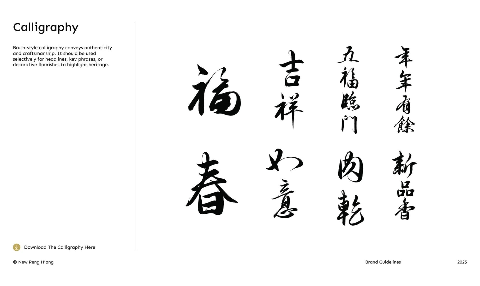
Calligraphy
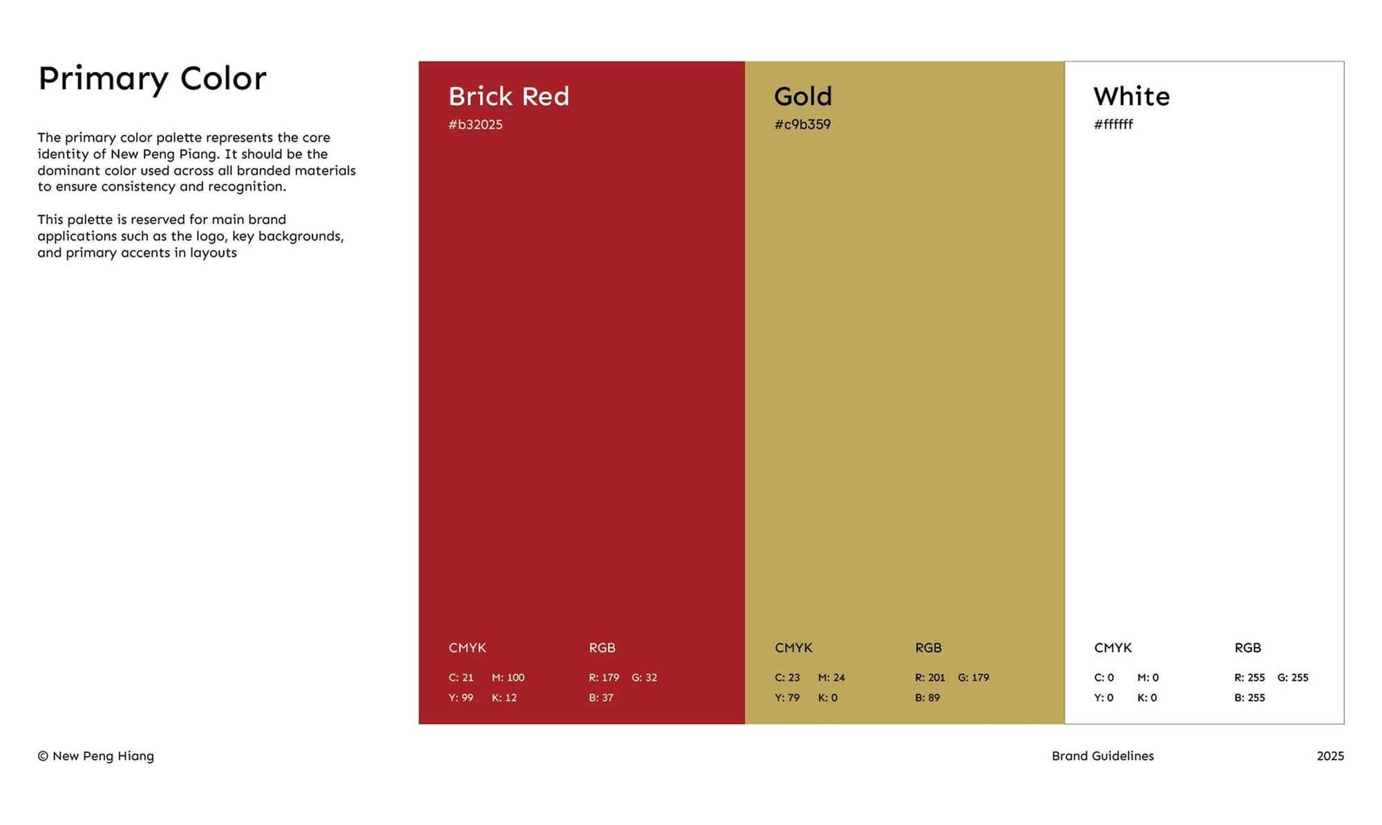
Primary Color
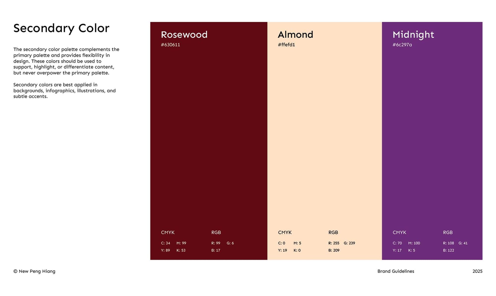
Secondary Color
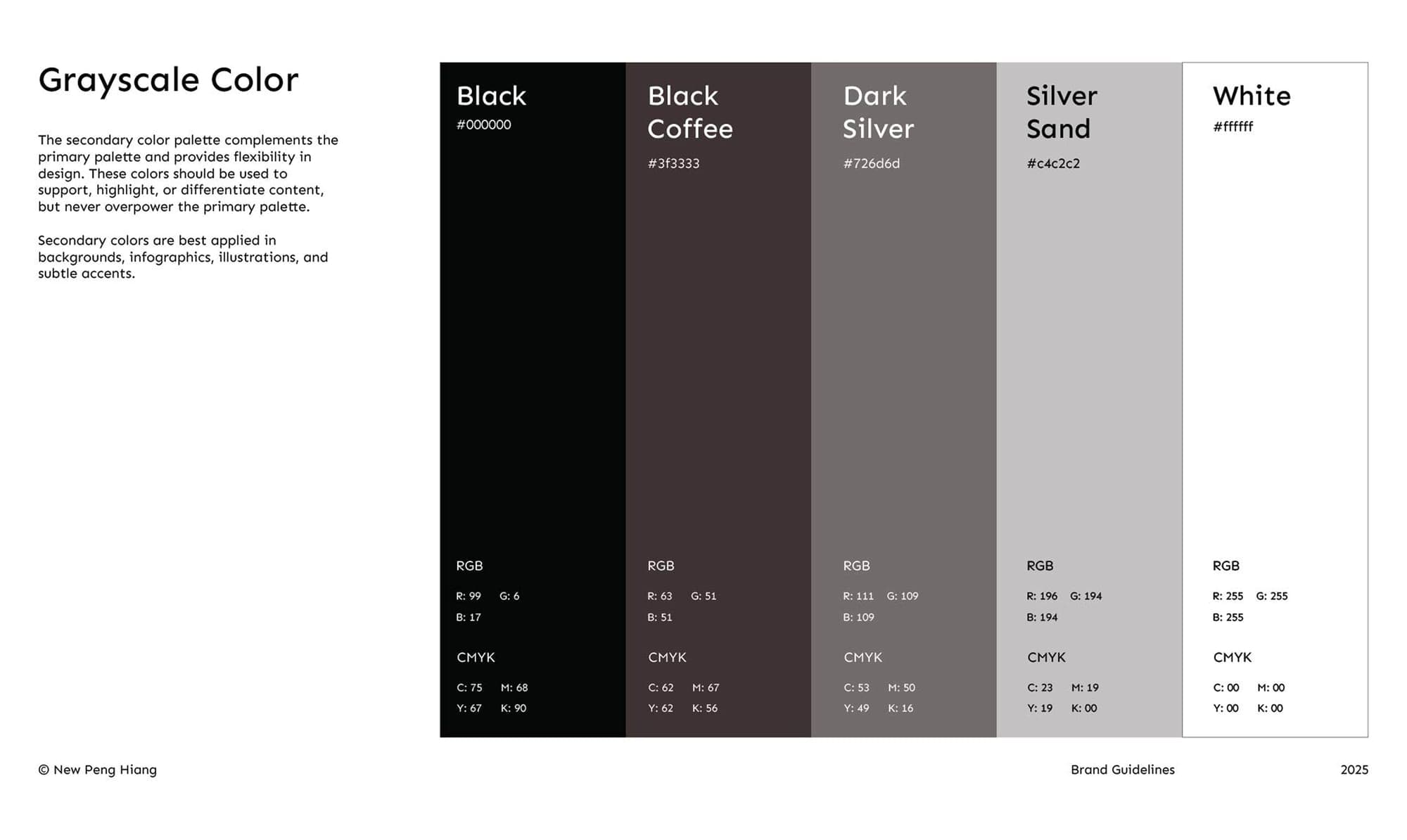
Grayscale Color
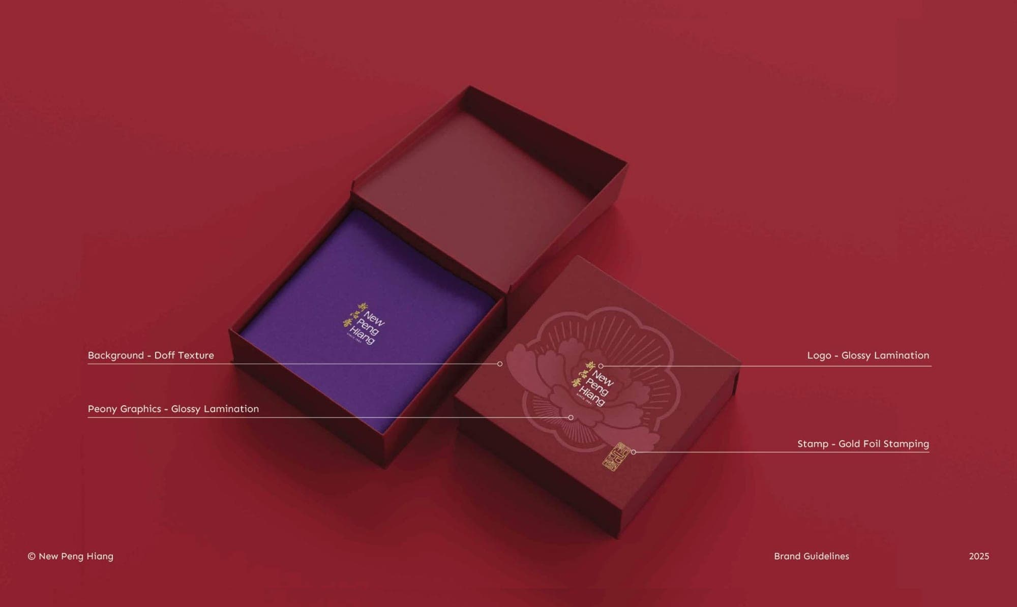
Box packaging open
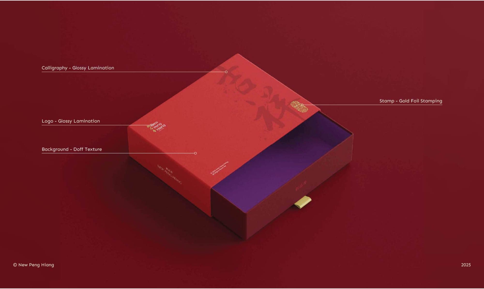
Box packaging drawer
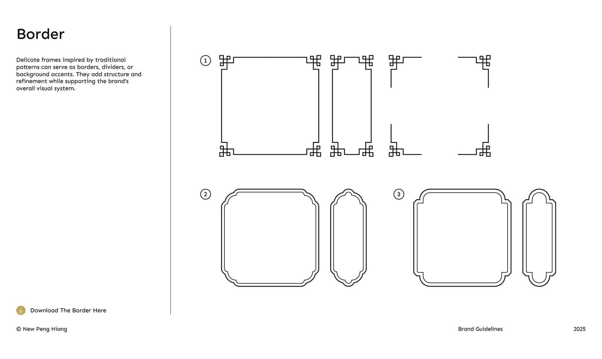
Border
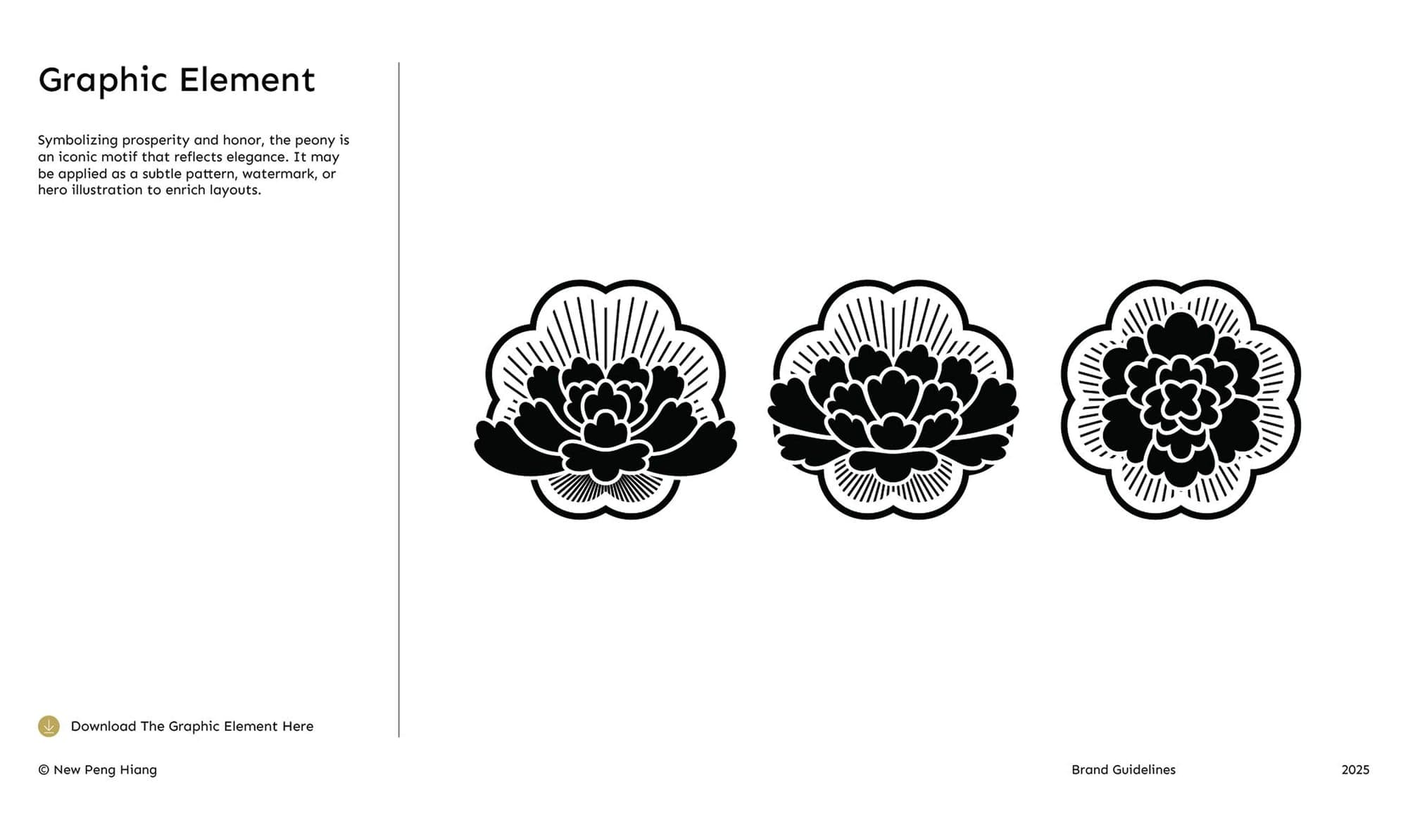
Graphic Element
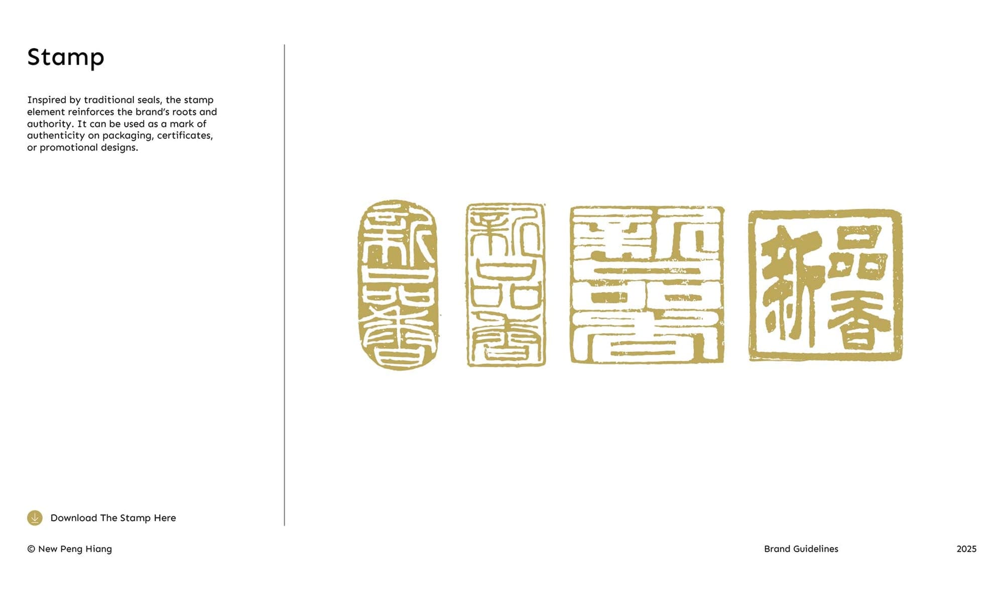
Stamp
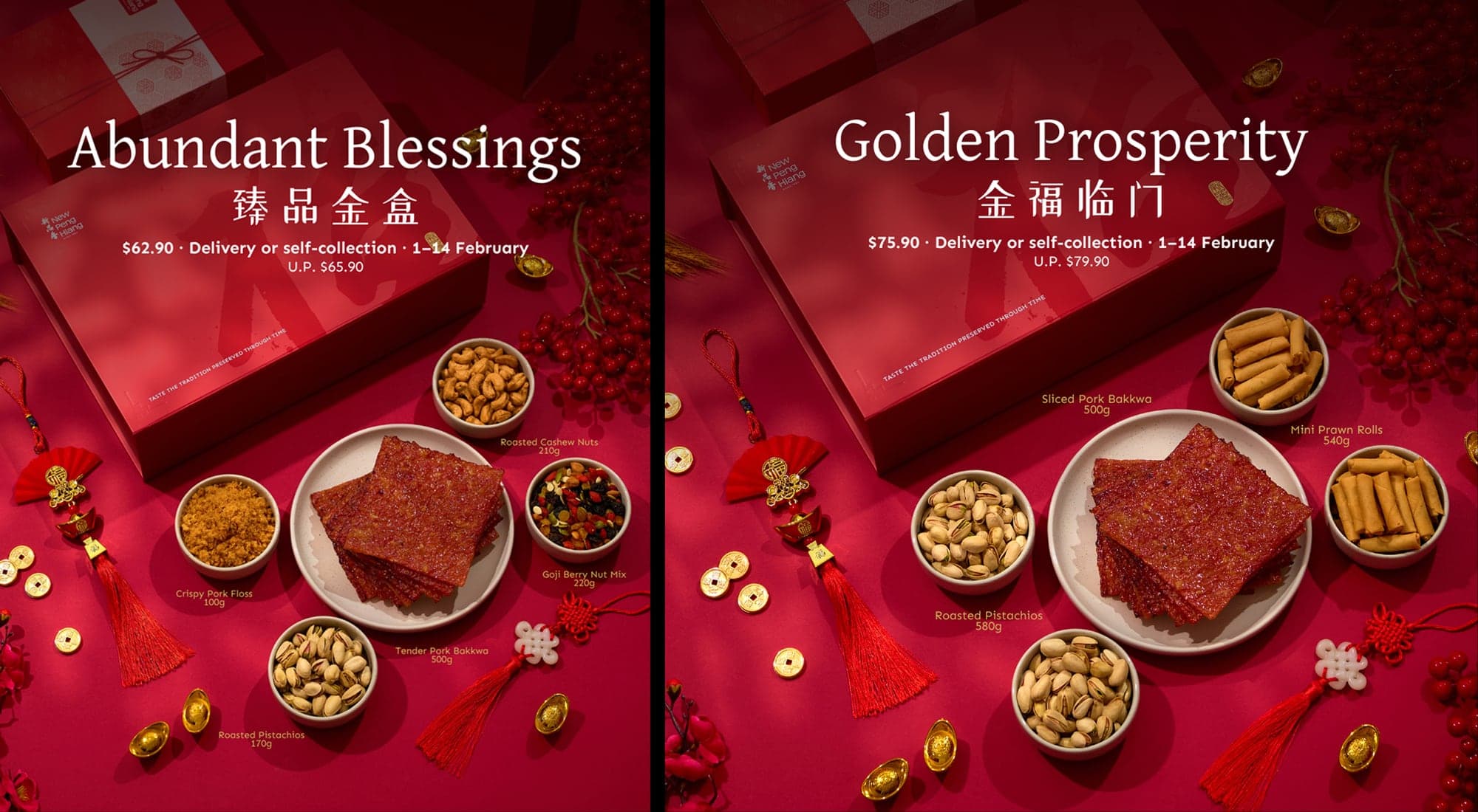
CNY ad posters (two-up)
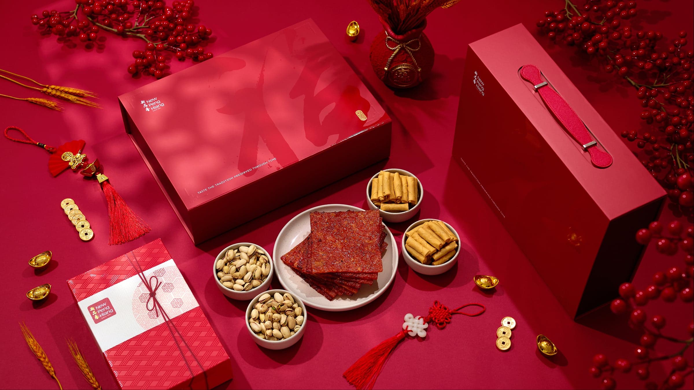
New Peng Hiang gift-box lifestyle spread
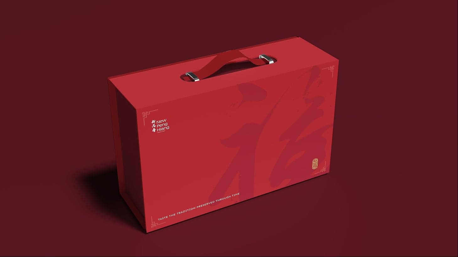
New Peng Hiang closed gift-box
New Peng Hiang open gift-box
New Peng Hiang Website

The digital experience was designed with clarity and ease at its core — ensuring accessibility for both long-time customers and a new, digitally native audience.

A clean and intuitive interface allows older users to navigate comfortably, with clear structures, legible typography, and straightforward pathways to key information. At the same time, the experience is optimised for speed and convenience, catering to a younger, on-the-go audience seeking quick and seamless access.
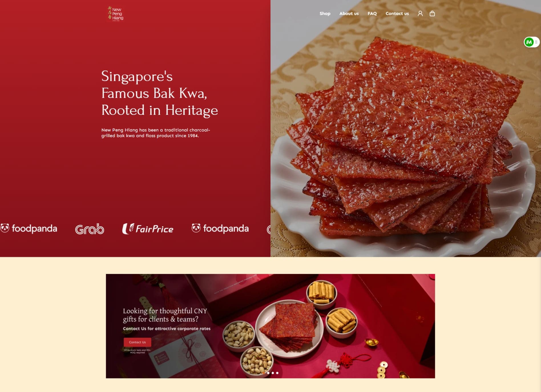

New Peng Hiang homepage (Singapore's Famous Bak Kwa, Rooted in Heritage)
The refreshed direction positions New Peng Hiang with a stronger and more contemporary presence, while remaining grounded in its heritage and craftsmanship. Together, the visual and digital changes elevate overall brand perception — creating a more premium, considered image while reinforcing familiarity and trust. New Peng Hiang now communicates with greater confidence across both physical and digital spaces, better equipped to grow its reach while preserving the qualities that define its legacy.